A color meanings chart is a simple guide to the ideas people commonly attach to colors. It helps explain why red can feel urgent, why blue often feels calm or trustworthy, and why white may suggest cleanliness in one setting but mourning in another.
People care about color because it shows up before words do. A logo, outfit, room, flag, flower arrangement, tattoo, or warning sign can make an impression in a second.
In the United States, color meanings come from several places at once: visible nature, the body, religion, national symbols, fashion, commerce, holidays, and everyday design. That mix is useful, but it also means no color has only one meaning.
Quick Answer
In modern U.S. culture, a color meanings chart usually shows how colors symbolize emotion, identity, warning, status, nature, purity, mourning, or celebration. Many common meanings come from visible associations, such as red with blood and danger or green with plants and money, but history, religion, fashion, and culture can change the meaning quickly.
TL;DR
- Color meanings depend on context and culture.
- Red often signals love, danger, or urgency.
- Blue often suggests calm, trust, or sadness.
- White is not universally bridal or pure.
- Branding uses color as shorthand, not proof.
- Spiritual meanings should be handled carefully.
What a Color Meanings Guide Can and Cannot Tell You
A color guide is most useful as a starting point. It can show common patterns, but it cannot tell you what every person will feel when they see a color.
That matters because color is personal. A color linked with comfort for one person may remind another person of a hospital, a school uniform, a sports loss, or a hard memory.
Culture also changes the reading. In the United States, black is still strongly tied to mourning and formal dress. In other settings, white may carry mourning meanings. Red may suggest danger in one place and wedding joy in another.
So the best way to read color is to ask four questions:
- Where is the color being used?
- Who is seeing it?
- What shade is it?
- What other symbols surround it?
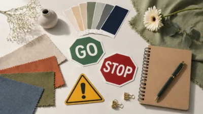
A red heart, a red stop sign, a red carpet, and a red political map do not mean the same thing. The color matters, but the setting does a lot of the work.
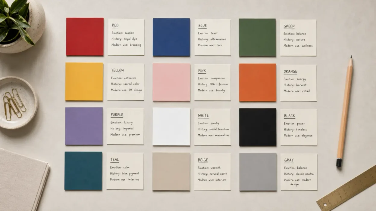
A Practical Chart for Common U.S. Color Meanings
The chart below gives broad U.S. associations. These are not fixed rules. They are common readings that shift by shade, use, and audience.
| Color family | Common U.S. meanings | When the meaning shifts |
| Red, orange, yellow | Energy, warmth, attention, warning | Romance, danger, autumn, school buses, sales |
| Blue, green, purple | Calm, trust, nature, growth, distinction | Sadness, money, royalty, spirituality, politics |
| Black, white, gray | Formality, purity, clarity, neutrality | Mourning, minimalism, luxury, sterility, ambiguity |
| Pink and pastels | Care, softness, youth, sweetness | Gender coding, nostalgia, irony, spring design |
| Brown and earth tones | Stability, comfort, nature, simplicity | Rustic style, plainness, age, environmental identity |
| Gold and silver | Value, honor, celebration, achievement | Wealth display, medals, anniversaries, sacred art |
This kind of chart works best when you read across the row instead of grabbing one word. For example, yellow can mean happiness, but it can also mean caution. Black can mean grief, but it can also mean elegance.
Warm Colors: Red, Orange, and Yellow
Warm colors tend to feel active because people connect them with heat, sunlight, fire, fruit, blood, and warning signals.
Red is the most intense of the group in U.S. culture. It is used for love on Valentine’s Day, urgency in sale signs, warning in stop signs, and status in red carpets. Its meanings developed partly because red is easy to notice and partly because the body itself turns red during anger, heat, embarrassment, or arousal.
That is why red can feel romantic and dangerous at the same time. A red rose and a red alarm do not contradict each other. They show how one color can carry several body-based meanings.
Orange often sits between red and yellow. It can suggest enthusiasm, friendliness, creativity, harvest, or visibility. In the United States, orange is also practical. It appears in traffic cones, hunting clothing, prison uniforms, Halloween decorations, and construction signs. That gives it both playful and cautionary meanings.
Yellow is often tied to sunlight, cheer, youth, and clarity. But yellow is also used for caution, illness, jealousy, or cowardice in some phrases and older traditions. Its brightness makes it useful for attention, which is why it appears in school buses, warning signs, and high-visibility design.
Warm colors do not always make people feel warmer or happier. Lighting, saturation, memory, and setting all matter. A soft butter yellow kitchen feels different from a harsh yellow warning label.
Cool Colors: Blue, Green, and Purple
Cool colors often carry calmer meanings in U.S. design, but they are not simple.
Blue is commonly linked with trust, order, calm, loyalty, and distance. It appears often in banks, technology brands, uniforms, and public institutions because it can feel stable and restrained. At the same time, English gives blue a sadness meaning, as in feeling blue.
Green starts with nature. Plants, grass, forests, crops, and spring all support meanings of growth, renewal, health, and balance. In the United States, green also means money because of its link with dollar bills. That gives green a double life: it can suggest environmental care or financial gain.
Green also has negative meanings. It can point to envy, sickness, inexperience, or toxicity, depending on the shade and setting. A bright neon green warning liquid feels very different from sage green bedding.
Purple is often linked with royalty, luxury, imagination, and spirituality. One reason is historical: strong purple dyes were once expensive and difficult to produce, so purple became tied to elite status in parts of the ancient Mediterranean and later European visual culture. In modern U.S. use, purple can also feel creative, mystical, sentimental, or solemn.
Cool colors may feel quiet, but they can still signal authority, wealth, grief, or devotion. Their meaning depends on whether they are pale, dark, bright, grayish, or paired with other colors.
Neutrals: Black, White, Gray, and Brown
Neutral colors often look simple, but their symbolism is some of the most context-dependent.
Black is linked with mourning, night, mystery, power, elegance, rebellion, and formality. A black funeral suit, black evening dress, black leather jacket, and black luxury package all say different things. The shared thread is seriousness, weight, and visual control.
White often suggests cleanliness, simplicity, innocence, peace, and new beginnings in U.S. settings. It appears in hospitals, kitchens, minimal design, bridal clothing, and religious imagery. But white is not a universal symbol of joy or purity. In some cultures and religious contexts, white may be linked with death, mourning, or ritual separation.
Gray usually suggests balance, age, professionalism, restraint, or uncertainty. It can feel calm and modern in design, but too much gray may feel dull or detached. Its meaning often depends on whether it leans warm, cool, silver, charcoal, or concrete-like.
Brown is tied to earth, wood, leather, soil, bread, coffee, and natural materials. It can mean comfort, durability, humility, tradition, or rustic taste. It can also be read as plain, old-fashioned, or heavy if the design around it feels flat.
Neutrals work like a stage. They can soften bright colors, make a design feel serious, or shift attention toward texture and shape.
Metallics, Pastels, and Shade Differences
A chart that treats every color as one flat idea misses a major point: shade changes meaning.
Gold often suggests wealth, victory, sacred value, warmth, and celebration. It appears in trophies, jewelry, holiday decor, religious art, and anniversary gifts. But gold can also feel excessive if it is used to show off.
Silver tends to suggest elegance, technology, clarity, age, moonlight, or second-place achievement. It can feel cleaner and cooler than gold. In fashion and decor, silver often reads as sleek or formal.
Pink has a complicated U.S. history. Today it often suggests sweetness, care, romance, girlhood, softness, or play. But those meanings are culturally made, not natural law. Bright pink can feel bold or ironic, while pale pink can feel tender or nostalgic.
Pastels often soften a color’s force. Pastel blue may feel babyish, springlike, or gentle. Pastel green may feel fresh or medicinal. Pastel yellow may feel cheerful without the alarm-like edge of bright yellow.
Dark shades add seriousness. Navy feels more official than sky blue. Burgundy feels heavier than bright red. Forest green feels more traditional than lime.
When interpreting color, shade is not a detail. It is part of the message.
Why These Meanings Developed
Color meanings often begin with things people can see.
Red links easily with blood, fire, ripe fruit, heat, and flushed skin. Green links with plants, spring, fertile land, and in the United States, money. Blue links with sky, water, distance, uniforms, and coolness. Black links with night and darkness. White links with light, milk, snow, paper, cleanliness, and blank space.
Material history also shaped meaning. Some pigments and dyes were once costly, unstable, rare, or hard to make. When a color was expensive to produce, it could become a sign of wealth or status. Purple is the clearest example, but bright whites, deep blacks, and brilliant synthetic colors also carried social meaning at different times.
Religion and ceremony added more layers. Colors used in worship, mourning, initiation, festivals, and sacred art became emotionally loaded because people saw them at meaningful moments.
Modern commerce added still another layer. Packaging, advertising, school colors, team colors, political maps, and digital interfaces repeat the same color cues until they feel natural.
That is why color symbolism is not just psychology. It is also habit, memory, cost, technology, ritual, and design.
How U.S. Culture Uses Color Today
In the United States, color often works as public shorthand.
The national color set of red, white, and blue points to patriotism, the flag, elections, civic ceremony, military service, and national holidays. These colors can feel unifying in one setting and politically charged in another.
Holiday colors are just as familiar. Red and green point to Christmas. Orange and black point to Halloween. Red, pink, and white point to Valentine’s Day. Pastels point to Easter and spring. Red, white, and blue point to Independence Day, Memorial Day, and many campaign visuals.
Weddings also show how meanings change. White bridal clothing is often treated as traditional in the United States, but its modern dominance is fairly recent. It became strongly tied to fashion, print culture, wealth, and later romantic ideals. Today, many people choose white because it looks bridal, not because they are making a strict moral statement.
Politics has its own color code. Red and blue now often point to party identity in the United States. Those meanings are modern political conventions, not ancient properties of the colors.
Sports colors create loyalty. A city may love a color combination because it belongs to a team. In that case, the color means belonging, memory, rivalry, and place.
Color in Branding, Clothing, Decor, and Digital Life
Color is one of the fastest ways to set expectations.
In branding, blue often aims for trust or competence. Green often suggests nature, health, money, or freshness. Black and white can suggest simplicity, luxury, or control. Red can signal appetite, urgency, excitement, or boldness.
These meanings are useful, but they are not magic. A blue logo does not make a company trustworthy. A green package does not make a product sustainable. Color can support a message, but it cannot prove the message.
In clothing, color helps people manage how they want to be seen. Black may feel polished, private, formal, or protective. Red may feel confident or romantic. Beige may feel calm, expensive, or understated. Bright colors may feel social, youthful, expressive, or playful.
In home decor, colors often point to mood. Soft blues and greens are often used for rest. Warm neutrals can make a room feel grounded. White can make a space feel clean and open, though too much white may feel cold. Dark colors can feel intimate, dramatic, or heavy.
Online, color works even faster. Red badges signal alerts. Green buttons often suggest progress or approval. Gray can signal disabled options or secondary information. Color meanings here are partly cultural and partly learned through interface habits.
Religion, Mourning, and Cross-Cultural Differences
Color meanings become most sensitive when they touch religion, mourning, national identity, or living traditions.
In Christian art and worship, colors may carry meanings tied to liturgical seasons, holiness, sacrifice, royalty, repentance, or celebration. These meanings vary by denomination and setting. It is better to speak of particular traditions than to claim one Christian meaning for every color.
In Hindu, Buddhist, Islamic, Jewish, Indigenous, and other traditions, colors can carry sacred, regional, or ceremonial meaning. Those meanings should not be treated as decoration when they are part of living practice.
Mourning colors also vary. Many Americans expect black at funerals, though this is not the only mourning color in the world. White has mourning associations in several Asian cultures and religious settings. Some communities use colors connected to the life, favorite clothing, military service, or cultural background of the person being remembered.
Cross-cultural color examples are useful only when they are specific. Saying “red means luck in Asia” is too broad. China, India, Japan, Korea, Vietnam, and many other places have different histories, religions, and color customs. Even within one country, class, region, generation, and occasion can change the meaning.
The safest rule is simple: when a color belongs to a sacred, national, mourning, or cultural practice, learn the context before using it.
Tattoos, Gifts, Flowers, and Personal Symbols
People often choose colors for personal reasons, not dictionary meanings.
A red tattoo may suggest passion, survival, courage, anger, love, or a specific memory. A blue tattoo may point to calm, grief, water, loyalty, or a loved one’s favorite color. Black ink may be chosen for style, contrast, permanence, or tradition rather than mourning.
Flower colors work the same way. Red roses are strongly linked with romantic love in U.S. culture, but red flowers can also be used for respect, courage, or remembrance. White flowers may suggest weddings, sympathy, peace, or simplicity. Yellow flowers may feel cheerful, friendly, or bright.
Gifts use color to set tone. A black box can make a gift feel formal. A pastel bag can make it feel gentle. Gold ribbon can make it feel celebratory. Brown kraft paper can make it feel handmade, natural, or modest.
Personal meaning can overrule public meaning. If your grandmother loved yellow, yellow may mean family warmth to you even if a chart lists caution. That does not make the chart wrong. It means symbolism is shared, but not identical for everyone.
Common Mistakes and Overclaims About Color
The biggest mistake is treating color as a universal code.
Color does not “always” make people feel one emotion. It does not guarantee behavior. It does not prove personality. It does not have the same meaning in every religion, culture, or time period.
Another mistake is treating modern internet lists as ancient tradition. Many charts blend real history, modern design advice, spiritual interpretation, folklore, and personal opinion without saying which is which.
Spiritual color meanings should be framed as beliefs or interpretive systems. Aura colors, chakra colors, candle color meanings, and manifestation color guides can be meaningful to people who use them, but they should not be presented as established historical fact unless a specific tradition supports the claim.
Awareness colors also need care. Ribbon colors are often shared by multiple causes. A single color may support different illnesses, memorials, or advocacy movements depending on the group and campaign.
The best color interpretation is modest. It says what a color often means, why it may mean that, where that meaning is common, and where it might not apply.
FAQs
What is the most common meaning of red?
In the United States, red most often points to strong attention: love, danger, urgency, anger, or passion. The exact meaning depends on the object, such as a rose, stop sign, sale tag, or heart.
What color means calm?
Blue and green are the most common calm colors in U.S. design. Blue often suggests quiet, order, or trust, while green suggests nature, rest, and balance.
Are color meanings spiritual?
They can be, but spiritual color meanings depend on the tradition or belief system. A color used in worship, meditation, candle practice, or sacred art should be explained within that setting rather than treated as a universal rule.
What do color tattoos mean?
Color tattoos usually mix public symbolism with personal meaning. Red may suggest love or courage, blue may suggest loyalty or grief, and green may suggest growth, but the wearer’s story matters most.
Is white always a symbol of purity?
No. In many U.S. wedding and design settings, white can suggest purity, cleanliness, simplicity, or new beginnings. In other cultural or religious settings, white may be connected to mourning, ritual separation, or death.
Why do brands use certain colors?
Brands use colors because people read them quickly. Blue may support trust, green may suggest nature or health, and red may create urgency, but color alone cannot make a brand honest, ethical, or appealing.
Can one color have opposite meanings?
Yes. Black can mean mourning or elegance. Yellow can mean happiness or caution. Green can mean nature, money, envy, or sickness, depending on shade and setting.
Conclusion
Color meanings are useful because they help people notice patterns in everyday life. Red often calls attention, blue often calms, green often points to nature or money, and black and white often carry serious ceremonial weight.