Pastel colors are pale, softened versions of familiar colors. They include shades like blush pink, baby blue, mint green, lavender, peach, pale yellow, and soft aqua. The meaning of pastel colors usually comes from this softened look: they feel lighter, quieter, and less forceful than bold colors.
People care about pastels because they appear everywhere in modern American life. They show up in baby clothes, spring displays, Easter decor, wedding palettes, skincare packaging, fashion trends, phone wallpapers, tattoos, and calming home interiors.
Pastels often feel gentle, but their meaning is not fixed. A pastel color can suggest innocence in one setting, nostalgia in another, luxury in another, and emotional restraint in another. Context matters.
Quick Answer
In the United States today, the meaning of pastel colors is most often calm, softness, innocence, freshness, and gentle optimism. Historically, pastels also connect to art, eighteenth-century European taste, springtime imagery, and later commercial uses such as baby clothing, weddings, beauty branding, and home decor.
TL;DR
- Pastels usually symbolize calm and softness.
- They are pale, low-intensity versions of colors.
- Meanings change by shade and context.
- U.S. baby-color meanings are modern.
- Pastels often suggest spring and renewal.
- Spiritual meanings are mostly interpretive.
What Pastel Colors Mean at a Glance
Pastel colors most often symbolize gentleness, calm, tenderness, innocence, renewal, and emotional ease. They do this because they soften stronger colors without removing the original color family.
Red can feel urgent or passionate. Pastel pink turns that energy into warmth, affection, or sweetness. Blue can feel steady or serious. Pastel blue often feels peaceful, airy, or clean. Green can suggest growth or nature. Mint green makes that meaning feel fresher and lighter.
This is why pastels are common in settings where people want comfort without drama. A pastel nursery feels softer than one painted in bright primary colors. A pastel wedding palette can suggest romance without heaviness. A pastel skincare label can imply gentleness, cleanliness, or sensitivity.
Still, pastels do not mean the same thing everywhere. A pastel color in a baby shower, a luxury boutique, an Easter service, a tattoo, and a social media aesthetic can carry different emotional messages.
The safest broad meaning is this: pastels soften the message of a color. They usually lower intensity and make a color feel more approachable.
What Counts as a Pastel Color?
A pastel is usually a color made lighter and less intense. In everyday terms, it looks like a regular color mixed with white.
Pastels are often described as:
- light rather than dark
- soft rather than bold
- muted rather than vivid
- airy rather than heavy
- gentle rather than sharp
This is why pastel red is usually read as pink, pastel purple as lavender, pastel green as mint, and pastel orange as peach. The base color still matters, but the softened version changes the emotional effect.
A pastel color is not just “pretty” or “feminine.” Those are cultural readings. The visual quality comes first. Pastels have more lightness and less saturation, so they place less visual pressure on the eye than a bright neon or deep jewel tone.
That visual softness is the foundation for most pastel symbolism. People often turn a physical impression into an emotional meaning. Because pastels look less forceful, they are often interpreted as kind, delicate, peaceful, youthful, or safe.
Why Pastels Feel Gentle Instead of Intense
Pastels feel gentle because they reduce the force of color. Bright red may feel loud. Deep purple may feel dramatic. Neon green may feel energetic. But when those colors become pale, the mood changes.
Light colors are often associated with openness, cleanliness, hope, and ease. Low-saturation colors tend to feel less aggressive than highly saturated ones. That does not mean pastels automatically change a person’s mood in a guaranteed way. It means people commonly read them as lower-pressure colors.
This is especially clear in design. A room painted in soft blue or pale green can feel quieter than the same room painted in cobalt or lime. A package in blush, cream, and pale peach may seem gentler than one in black and red.
Pastel symbolism also depends on contrast. A pastel pink dress in a spring garden may feel romantic. The same color used in a horror movie set may feel eerie because it clashes with the scene. A pastel logo for a children’s brand may seem sweet. A pastel logo for a financial firm may seem friendly but possibly less formal.
So the emotional meaning of pastels is real in culture, but not automatic in every situation. Pastels suggest calm because people have learned to connect lightness and softness with ease.
Historical Roots: From Pastel Medium to Rococo Softness
The word “pastel” has an art history before it has a modern color-palette meaning. Pastel sticks are made from pigment mixed with a binder. Artists used them to create soft, powdery color effects.
In eighteenth-century Europe, pastel portraiture became fashionable among wealthy patrons. The medium could produce delicate skin tones, luminous fabric, and refined surfaces. It suited the taste for intimacy, elegance, and polished social presentation.
Pastel colors also fit the Rococo style. Rococo design favored lightness, ornament, curves, floral forms, shells, mirrors, ivory, gold, and soft color. It moved away from the heavier grandeur of earlier Baroque court style and toward more intimate rooms, decorative arts, portraits, and playful scenes.
This history matters, but it should not be overstated. Modern pastel symbolism does not come from one single origin. Today’s pastel meanings also come from baby clothing, spring marketing, weddings, beauty products, home decor, digital aesthetics, and fashion cycles.
The historical link does help explain why pastels often feel refined rather than rustic. They have long been used in settings connected to polish, leisure, decoration, and delicate finish.
Pastel Colors in Modern U.S. Culture
In the United States, pastel colors often appear when people want something to feel soft, clean, hopeful, or emotionally safe. They are common in both personal and commercial settings.
You may see pastels in:
- baby showers and nursery decor
- Easter decorations and spring displays
- wedding flowers and bridesmaid dresses
- skincare, wellness, and beauty packaging
- boutique branding and lifestyle products
- home interiors, especially bedrooms and bathrooms
- fashion, especially spring and summer clothing
- social media graphics and “soft aesthetic” design
- tattoos that aim for a gentle or dreamy look
This U.S. meaning is shaped by everyday repetition. When stores fill spring aisles with pale yellow, lavender, mint, and pink, shoppers learn to connect pastels with seasonal renewal. When baby products use pale blue, pink, cream, and yellow, people connect them with infancy. When wellness brands use blush and sage, people connect those colors with calm and care.
Pastels can also signal emotional restraint. They let people use color without seeming loud. This is one reason pastels work well in professional branding, home decor, and formal events. They offer color, but they rarely dominate a room.
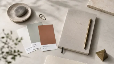
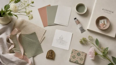
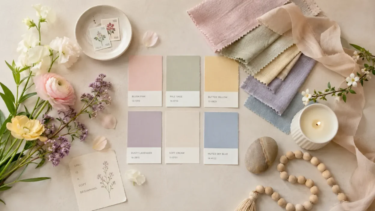
The Main Pastel Shades and Their Common Meanings
Each pastel shade carries the base meaning of its color, then softens it. A pastel version usually feels less intense, less formal, and more approachable.
| Pastel Shade | Common Modern Meaning | Context Notes |
|---|---|---|
| Pastel pink | tenderness, affection, sweetness | Can also feel romantic, youthful, or gender-coded |
| Pastel blue | calm, trust, cleanliness, peace | Common in baby, healthcare, beach, and spa settings |
| Mint green | freshness, renewal, light nature | Often used for wellness, spring, and clean design |
| Lavender | softness, imagination, gentle elegance | Can suggest romance, spirituality, or nostalgia |
| Pale yellow | optimism, warmth, spring light | Softer than bright yellow, less energetic |
| Peach | warmth, friendliness, approachability | Common in beauty, weddings, and soft decor |
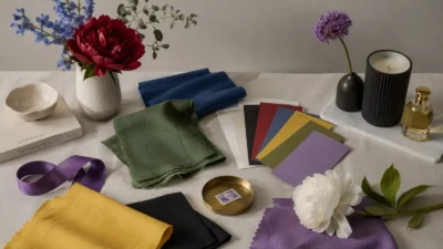
These meanings are not rules. They are common readings. A pastel color can shift when paired with other colors.
Pastel pink with white can feel innocent. Pastel pink with black can feel stylish or ironic. Lavender with silver can feel dreamy. Lavender with beige can feel vintage. Mint green with cream can feel fresh and clean. Mint green with red can feel retro.
This is why pastel symbolism works best when you read the whole setting, not just the color.
Spring, Easter, and New Beginnings
Pastels are strongly linked with spring in the United States. This connection is easy to understand. Spring brings pale flowers, lighter clothing, softer daylight, fresh grass, and seasonal displays after winter.
Pastel colors fit that visual world. Pale yellow can suggest early sunlight or chicks. Mint green can suggest new leaves. Lavender and pink can suggest spring flowers. Soft blue can suggest clearer skies.
Pastels are also common around Easter. In Christian contexts, Easter centers on resurrection, hope, and new life. In broader American culture, Easter is also tied to eggs, baskets, flowers, rabbits, new clothes, and spring gatherings. Pastels work well for both the religious and seasonal sides of the holiday.
It is important not to treat every pastel Easter decoration as sacred symbolism. Some uses are religious. Some are seasonal. Some are commercial. A pastel Easter egg in a church craft may point toward renewal and celebration. A pastel candy display in a store may mostly use spring colors to feel festive and cheerful.
Pastels became part of the broader American spring language because they visually match the season’s softer, lighter mood.
Baby Colors, Gender, and the U.S. Pastel Code
Pastel colors have a strong place in American baby culture. Pale pink, baby blue, soft yellow, mint green, lavender, and cream are common for newborn clothing, nursery walls, shower decorations, and birth announcements.
But these meanings are not ancient. In the United States, pastel baby colors became popular before pink and blue settled into today’s familiar gender code. For a long time, babies were commonly dressed in white because it was practical and washable. Later, pastel colors became fashionable for infants.
The pink-for-girls and blue-for-boys pattern became stronger in the twentieth century, especially through clothing, retail, advertising, and postwar consumer culture. Earlier use was less consistent. Some stores and writers even recommended pink for boys and blue for girls.
This history matters because it shows how symbolic meanings can feel natural after enough repetition. Today, many Americans immediately read pastel pink as feminine and baby blue as masculine, especially in birth announcements and gender reveal parties. But that reading is cultural, not universal.
Modern families also use pastels in more flexible ways. Yellow, green, lavender, cream, and mixed pastel palettes often appear when people want a softer or less gendered baby style.
Pastels in Branding, Decor, Weddings, and Fashion
Pastels work well in modern U.S. design because they communicate softness quickly. They are easy to read, easy to combine, and less visually demanding than saturated color.
In branding, pastels often suggest:
- gentle care
- approachability
- cleanliness
- youthfulness
- calm confidence
- light luxury
This is why they are common in skincare, wellness, candles, stationery, bakeries, children’s products, and lifestyle brands. A pastel package can make a product feel safe, mild, or friendly before anyone reads the label.
In home decor, pastels often create a softer room. Pale blue can make a bedroom feel quiet. Sage or mint can make a kitchen feel fresh. Blush and cream can make a living room feel warm without feeling heavy.
In weddings, pastels often suggest romance, spring, and tenderness. They allow color while keeping the mood formal enough for ceremony. Blush, dusty blue, lavender, peach, champagne, and soft green are especially common.
In fashion, pastels move in and out of trend cycles, but they rarely disappear. They often return in spring and summer because they pair well with lighter fabrics and seasonal sunlight. In recent years, pastels have also appeared in gender-fluid fashion, nostalgic styling, soft minimalism, and playful “candy color” looks.
Spiritual, Folklore, and Internet Meanings
Pastel colors do appear in spiritual and symbolic interpretation, but these meanings need careful framing. There is no single ancient system where all pastel colors have fixed spiritual meanings.
In modern spiritual writing, pastels are often linked with gentle healing, emotional openness, compassion, peace, aura colors, or softness of energy. These are belief-based interpretations, not established historical facts. They may be meaningful to people who use those systems, but they should not be presented as universal truth.
Pastel meanings also appear in internet aesthetics. A pastel feed, room, outfit, or wallpaper may suggest softness, cuteness, nostalgia, fantasy, romance, or emotional gentleness. Some aesthetics use pastels sincerely. Others use them ironically, mixing soft colors with darker themes.
Pastels can also create a dreamlike or unreal mood. This is why they appear in fantasy art, anime-inspired design, doll-like fashion, toy photography, and surreal interiors. In those settings, pastels do not only mean innocence. They can also mean escape, artificial sweetness, nostalgia, or a carefully built personal world.
The key is to separate spiritual belief from cultural style. Both can matter, but they are not the same kind of evidence.
Misuse, Oversimplification, and Negative Readings
Pastel colors are often treated as harmless, but they can carry limiting meanings in some contexts.
One common oversimplification is the idea that pastels are naturally feminine. In U.S. culture, pastels have often been marketed to women, girls, babies, brides, and beauty consumers. That history shapes how people read them. But the colors themselves are not biologically feminine. Their gendered meaning comes from culture, retail, and repetition.
Pastels can also be used to make serious subjects feel softer than they are. A company may use pale colors to seem gentle, even if the product or policy deserves closer attention. A brand can use pastel packaging to imply “clean,” “safe,” or “natural” without proving those claims.
There is also a negative reading of pastels as childish, weak, sentimental, or overly sweet. This depends on context. In a nursery, softness may be the point. In a law firm logo, too much softness might seem less authoritative. In fashion, a pastel outfit can feel fresh and elegant, or it can feel intentionally doll-like.
Pastels can also become eerie when paired with unsettling content. Horror, satire, and pop culture sometimes use pastel colors to make sweetness feel artificial or disturbing.
So pastel symbolism is not only gentle. It can also signal youth, nostalgia, commercial softness, emotional masking, or ironic sweetness.
FAQs
What do pastel colors symbolize?
Pastel colors usually symbolize calm, softness, innocence, freshness, and gentle optimism. The exact meaning depends on the shade and setting, so pastel pink, blue, green, lavender, and yellow do not all communicate the same thing.
What do pastel colors mean spiritually?
In modern spiritual interpretation, pastels are often linked with peace, emotional healing, compassion, or gentle energy. These meanings are belief-based and should not be treated as proven facts or universal religious teachings.
What do pastel colors mean in tattoos?
Pastel tattoos often suggest softness, tenderness, nostalgia, fantasy, or a lighter emotional tone. The meaning depends more on the image than the color alone, so a pastel flower, moon, butterfly, or heart will each carry its own symbolism.
Are pastel colors feminine?
Pastels are often read as feminine in modern U.S. culture because of fashion, beauty marketing, weddings, and baby-color traditions. That meaning is cultural, not natural or universal, and many people use pastels in gender-neutral or masculine styles.
Why are pastels associated with Easter?
Pastels are associated with Easter because they match spring imagery: flowers, eggs, new growth, soft light, and seasonal renewal. In Christian settings, they can support themes of hope and new life, while in stores and home decor they are often used more broadly as cheerful spring colors.
Do pastel colors have negative meanings?
They can. Pastels may be read as childish, overly sweet, weak, artificial, or emotionally softened in some contexts. They can also be used commercially to make a brand feel gentle or safe without proving that it is.
Are pastel color meanings the same in every culture?
No. Some broad impressions, like lightness and softness, may be widely understood, but symbolic meanings vary by culture, religion, fashion history, and setting. It is better to read pastels as context-sensitive colors rather than universal symbols.
Conclusion
Pastel colors most clearly symbolize softness, calm, freshness, and gentle emotion. They take the force of a stronger color and make it lighter, quieter, and easier to approach.