Warm colors are the reds, oranges, yellows, and nearby tones that people often connect with heat, sunlight, fire, autumn, and strong emotion. In everyday life, they show up in stop signs, holiday decorations, sports uniforms, lipstick, restaurant logos, warning labels, fall leaves, and cozy living rooms.
That is why warm color meanings matter. These colors do not only decorate a space or outfit. They often signal a feeling before a person reads a word.
In the United States, warm colors usually suggest energy, confidence, comfort, urgency, happiness, appetite, danger, or celebration. The meaning depends on the exact shade and the setting. A soft peach wall does not say the same thing as a red emergency sign or a neon orange traffic cone.
The clearest way to understand warm colors is to treat them as flexible symbols. They are shaped by nature, art, safety systems, religion, fashion, marketing, and personal memory.
Quick Answer
In modern U.S. symbolism, warm color meanings usually center on energy, warmth, attention, passion, comfort, optimism, and urgency. These meanings developed partly from natural associations with fire, sunlight, blood, ripe fruit, autumn leaves, and heat, but they change by shade, culture, and context.
TL;DR
- Warm colors usually include red, orange, and yellow.
- They often suggest energy, heat, comfort, or attention.
- Red can mean love, danger, power, or urgency.
- Orange often suggests autumn, friendliness, or warning.
- Yellow can mean joy, sunlight, clarity, or caution.
- Context matters more than any fixed meaning.
What Warm Colors Mean at a Glance
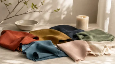
Warm colors are colors that sit on the red-orange-yellow side of many color wheels. They include clear red, orange, and yellow, along with related shades such as coral, peach, amber, gold, rust, terracotta, marigold, scarlet, and burgundy.
Symbolically, they tend to feel active. They come forward. They catch the eye. They can make a room feel lively, a logo feel bold, or a warning sign feel impossible to ignore.
The most common meanings are:
- energy
- heat
- passion
- comfort
- appetite
- warning
- optimism
- celebration
- movement
- confidence
But these meanings are not automatic laws. Warm colors can feel joyful in one setting and stressful in another. A yellow kitchen may feel sunny. A yellow caution sign tells you to slow down. A red rose can suggest romance. A red light tells you to stop.
That tension is part of what makes warm colors so useful as symbols.
Why Red, Orange, and Yellow Feel “Warm”
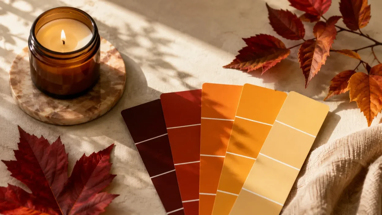
Warm colors feel warm because people connect them with things that give off heat or light. Fire is red, orange, and yellow. The sun appears golden or orange near sunrise and sunset. Hot metal can glow red or orange. Autumn leaves often turn yellow, orange, and red as the season changes.
These natural links helped shape symbolic meaning long before modern branding or interior design. A color that looks like flame can suggest danger, life, food, protection, destruction, or gathering around a hearth. A color that looks like sunlight can suggest hope, clarity, growth, or exposure.
There is also a visual reason. Warm colors often feel closer and more intense than cool colors. In art and design, they are often used to bring attention forward. This is why a red button, a yellow sign, or an orange sale tag can feel more urgent than a muted blue or gray one.
Still, “warm” is a human label, not a physical temperature. A red wall is not warmer than a blue wall by itself. The feeling comes from perception, memory, culture, and use.
The Core Symbolic Meanings of Warm Colors Today
Warm colors often share a family resemblance, but each one has its own range. The same hue can carry both positive and negative meanings.
| Warm color | Common positive meanings | Common cautionary meanings |
|---|---|---|
| Red | love, courage, power, excitement | danger, anger, urgency, aggression |
| Orange | friendliness, creativity, autumn, movement | warning, cheapness, overstimulation |
| Yellow | joy, sunlight, clarity, hope | caution, anxiety, impatience |
| Gold | success, value, celebration, achievement | excess, vanity, status display |
| Rust or terracotta | earthiness, age, warmth, stability | heaviness, decay, outdated style |
This table is a starting point, not a rulebook. A color’s meaning depends on where it appears.
A red dress, a red crosswalk signal, and a red sports jersey all use the same color family. They do not send the same message. The object, culture, shade, and occasion complete the symbol.
Red: Love, Warning, Power, and Urgency
Red is the most intense warm color in modern U.S. symbolism. It is strongly tied to the body, especially blood, blushing, heat, and heightened emotion. That helps explain why it can represent both love and danger.
In romance, red appears in roses, hearts, lipstick, Valentine’s Day cards, eveningwear, and gift packaging. It suggests desire, affection, attraction, and bold feeling. In this setting, red says, “Pay attention to emotion.”
In public safety, red sends a different message. Stop signs, red traffic lights, fire alarms, emergency buttons, and prohibition symbols all use red because it is hard to miss. Here red does not mean romance. It means stop, danger, urgency, or immediate action.
Red also carries meanings of power and prestige. Red carpets, red ties, red uniforms, and red accents in luxury branding can suggest confidence, ceremony, or high status. In sports, red often feels aggressive, energetic, and competitive.
This is why red is easy to misuse. Too much red in a calm space can feel tense. A red logo may feel bold, but it can also feel loud. A red tattoo may suggest passion or strength, but the surrounding image changes the message. A red rose tattoo reads differently from a red flame, red dagger, or red heart.
Red is not one symbol. It is a signal color with many emotional directions.
Orange: Warmth, Change, Playfulness, and Alertness
Orange sits between red and yellow, and its symbolism often combines parts of both. It has red’s energy and yellow’s brightness, but it usually feels less formal than red and less sharp than yellow.
In the United States, orange is strongly linked with autumn. Pumpkins, fall leaves, harvest decor, Halloween, Thanksgiving palettes, and seasonal candles all make orange feel warm, earthy, and transitional. It can suggest change, ripeness, and the turning of the year.
Orange also feels social. In branding and design, it often suggests friendliness, approachability, play, value, or action. A bright orange button can feel energetic without the severity of red.
But orange can also warn. Traffic cones, construction signs, safety vests, and hazard labels make orange a practical color of alertness. It tells people to notice a changing or risky situation.
The shade matters. Neon orange feels urgent. Pumpkin orange feels seasonal. Burnt orange feels earthy or nostalgic. Peach feels soft, gentle, and personal. Rust can feel grounded, vintage, or heavy depending on the setting.
Orange is rarely neutral. It usually wants to be noticed.
Yellow: Sunlight, Joy, Caution, and Mental Brightness
Yellow is often linked with sunlight, warmth, cheer, freshness, and mental clarity. In U.S. culture, it appears in smiley faces, school buses, spring flowers, lemons, highlighters, caution signs, and bright packaging.
Its positive meaning comes from light. Yellow can suggest hope, awareness, intelligence, youth, friendliness, or a new beginning. A pale yellow room may feel soft and sunny. A golden-yellow dress may feel cheerful and confident.
But yellow also has a warning side. It is used for caution because it is highly visible. Yellow road signs, caution tape, wet-floor signs, and hazard markings train people to read yellow as “pay attention.”
This double meaning can make yellow tricky. A gentle butter yellow can feel comforting. A harsh neon yellow can feel anxious or irritating. Mustard yellow can feel retro or earthy. Gold can feel celebratory, wealthy, or sacred, but also flashy when overused.
Yellow is best understood as the color of visibility. Sometimes that visibility feels joyful. Sometimes it feels like a warning.
How Shade Changes the Meaning
Warm colors do not all speak with the same voice. Shade, brightness, and saturation change the symbolism.
- Scarlet feels urgent, passionate, and dramatic.
- Burgundy feels mature, formal, romantic, or luxurious.
- Coral feels friendly, warm, and social.
- Peach feels soft, welcoming, and gentle.
- Amber feels glowing, nostalgic, and preserved.
- Gold feels valuable, ceremonial, successful, or sacred.
- Mustard feels retro, earthy, intellectual, or vintage.
- Terracotta feels grounded, handmade, warm, and rustic.
- Neon orange or yellow feels alert, artificial, and high-energy.
This is why broad claims about color can mislead. “Yellow means happiness” is too simple. Lemon yellow, gold, mustard, and fluorescent yellow do not create the same impression.
A good interpretation starts with the exact shade, then asks where it appears.
Warm Colors in U.S. Holidays, Clothing, Decor, and Branding
Warm colors are deeply woven into American visual culture. They help mark seasons, sell products, decorate homes, and express personality.
In holidays, warm colors often create seasonal mood. Red dominates Valentine’s Day and appears with green at Christmas. Orange and black shape Halloween. Orange, yellow, red, brown, and gold often appear around Thanksgiving and fall decorating. Yellow and pastel warm tones appear in spring and Easter settings.
In clothing, warm colors can suggest confidence, approachability, boldness, or warmth. A red dress often feels dramatic. A rust sweater feels cozy and autumnal. A yellow raincoat feels cheerful and visible. A coral shirt feels friendly and casual.
In home decor, warm colors can make a space feel lively or intimate. Terracotta, ochre, clay, cream, and muted gold are often used to create warmth without the intensity of bright red or neon orange. Brighter warm colors can work well as accents, but they may feel overstimulating in bedrooms or quiet rooms.
In branding, warm colors are often used to attract attention and encourage action. Restaurants, sports teams, entertainment brands, children’s products, discount labels, and food packaging often use red, orange, or yellow because these colors feel immediate and visible.
That does not mean warm colors “make” people behave in one fixed way. They shape first impressions, but meaning still depends on the brand, audience, product, and design.
Spiritual, Religious, and Folklore Meanings
Warm colors also appear in religious and spiritual traditions, but they should be handled with care. Their meanings are not the same across traditions.
Red may appear in ceremonies, sacred art, festival clothing, protective customs, or symbols of life and sacrifice. In some contexts it is connected with celebration, vitality, or divine power. In others, it may suggest blood, martyrdom, temptation, or danger.
Yellow and gold often appear in religious art because they resemble light, sun, precious metal, or radiance. Gold can suggest holiness, honor, illumination, or divine presence in some traditions. But it can also symbolize wealth, pride, or worldly display in other settings.
Orange has specific religious importance in some Asian traditions, especially where saffron or orange robes are used. In a U.S. general-audience article, it is important not to reduce that use to a vague “spiritual color.” It belongs to living traditions with their own histories and meanings.
Folklore and modern spirituality may connect warm colors with energy, fire, creativity, confidence, or personal power. These are interpretations, not proven facts. They can be meaningful to individuals, but they should not be presented as universal truth.
Cross-Cultural Meanings and Why Context Matters
Warm color meanings change across cultures. Red may suggest love in one setting, luck in another, mourning in another, or political identity in another. Yellow may suggest sunlight and joy in one place, royalty or sacred meaning in another, and caution in a modern road system. Orange may suggest autumn in the United States, but religious identity or national identity elsewhere.
The same color can also change meaning over time. A pigment that once signaled wealth because it was rare may later become common. A holiday color may become stronger because of advertising. A safety color may become widely understood because governments, schools, and workplaces repeat it for generations.
This is why it is safer to say “in many modern U.S. settings” rather than “everywhere.” Color symbolism is shared enough to be useful, but flexible enough to be misunderstood.
For interpretation, ask four questions:
- Where is the color being used?
- What object or image carries it?
- Who is using it?
- What cultural setting surrounds it?
Those questions matter more than a single dictionary-style meaning.
Misuse, Oversimplification, and Modern Internet Meanings
Warm colors are often oversimplified online. A post may say red means passion, orange means creativity, and yellow means happiness. Those meanings can be useful, but they are incomplete.
The problem is not that they are false. The problem is that they are too neat.
Red can mean love, but it can also mean debt, anger, heat, danger, or political identity. Orange can mean creativity, but it can also mean construction, Halloween, prison uniforms, or discount pricing. Yellow can mean joy, but it can also mean caution, illness, anxiety, or high visibility.
Modern internet aesthetics also change how warm colors are read. A soft peach-and-cream palette may feel wellness-oriented. A burnt orange and brown palette may feel vintage. A red-and-black palette may feel intense or edgy. A yellow smiley face may feel playful, ironic, nostalgic, or commercial depending on the style.
The safest interpretation is contextual. Warm colors suggest heat, energy, attention, and emotional intensity. The exact meaning comes from the shade, object, culture, and moment.
FAQs
What do warm colors symbolize?
Warm colors usually symbolize energy, heat, attention, comfort, passion, joy, or urgency. In modern U.S. culture, they often feel active and emotionally direct, but they can also signal caution or danger.
Are warm colors positive or negative?
They can be either. Red can mean love or danger, orange can mean friendliness or warning, and yellow can mean happiness or caution. The setting decides whether the meaning feels inviting, intense, cheerful, or stressful.
What do warm colors mean in tattoos?
Warm color tattoos often suggest passion, strength, vitality, creativity, confidence, warmth, or transformation. The image matters more than the color alone, so a red rose, orange flame, golden sun, and yellow butterfly all carry different meanings.
Do warm colors have spiritual meanings?
They can, but spiritual meanings depend on the tradition. Some people connect warm colors with fire, sunlight, vitality, courage, or divine light, while specific religions may use red, orange, yellow, or gold in much more precise ways.
What do warm colors mean in home decor?
In home decor, warm colors often make a space feel cozy, lively, welcoming, or intimate. Muted warm tones such as terracotta, ochre, peach, rust, and soft gold usually feel calmer than bright red, neon orange, or intense yellow.
Why are warm colors used in advertising?
Warm colors are often used because they attract attention quickly. Red, orange, and yellow can make a design feel energetic, appetizing, friendly, urgent, or easy to notice, depending on the product and audience.
Are warm color meanings universal?
No. Some associations, such as fire and sunlight, are widely understandable, but cultural meaning changes from place to place. A warm color’s meaning depends on tradition, history, setting, and use.
Conclusion
Warm colors are among the most visible and emotionally direct colors in everyday life. They can suggest fire, sunlight, blood, celebration, ripeness, warning, comfort, or movement. That range explains why they appear so often in signs, clothing, holidays, interiors, logos, tattoos, and art.