Color feels simple until you try to explain it. Red can mean love on Valentine’s Day, danger on a stop sign, pride on a team jersey, or power in a formal outfit. That is why a color meaning printable can be useful: it gives you a starting point without making you memorize every possible association.
People use color charts for art, journaling, classrooms, tattoos, mood boards, decor, branding, clothing, and event planning. In the United States, many color meanings are shaped by holidays, advertising, traffic signs, sports, politics, weddings, funerals, and pop culture.
Still, color meanings are not universal laws. They are patterns. A good guide explains the common meaning, the reason behind it, and the setting where that meaning makes sense.
Quick Answer
In the United States, a color meaning printable usually symbolizes a practical guide to emotional, cultural, and design meanings connected with each color. It is most useful when it treats color meanings as context-based associations, shaped by history, culture, personal memory, religion, branding, and everyday use.
TL;DR
- Color meanings shift by culture and setting.
- Red often signals love, danger, or power.
- Blue often suggests trust, calm, or sadness.
- Green connects with nature, money, and growth.
- Black and white carry opposite meanings by context.
- Printable charts work best as flexible guides.
What a Color Meaning Printable Is Really For
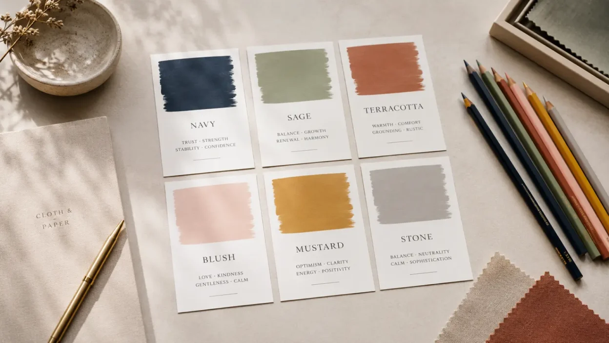
A color meaning printable is a quick reference chart that explains common associations for different colors. It might list red as love or danger, blue as calm or trust, green as nature or money, and yellow as joy or caution.
That kind of chart is helpful because color is one of the fastest symbolic tools people use. Before anyone reads a word, they often notice the color of a sign, dress, logo, room, flower arrangement, or digital graphic.
But a printable should not pretend that every color has one fixed meaning. Color meaning depends on several things: the shade, the setting, the culture, the object, the occasion, and the viewer’s own memories.
A red rose, a red warning light, a red carpet, and a red political map do not say the same thing. They share a color, but not a message.
The best printable color chart gives you a clear first impression and then leaves room for context.
The Core U.S. Meanings of Common Colors
Most American readers recognize a few broad color meanings because they appear often in daily life. These meanings show up in traffic signals, holidays, product packaging, school art lessons, sports uniforms, wedding traditions, and advertising.
Here is a practical chart for common U.S. use:
| Color | Common U.S. Meanings | Context That Changes It |
|---|---|---|
| Red | Love, danger, urgency, anger, power | Valentine’s Day, warning signs, sports, politics |
| Blue | Calm, trust, sadness, loyalty | Corporate branding, police, winter, water, patriotism |
| Green | Nature, money, growth, luck, health | Environmental design, finance, St. Patrick’s Day |
| Yellow | Joy, warmth, attention, caution | School buses, warning signs, sunshine, children’s design |
| Black | Elegance, mourning, authority, mystery | Fashion, funerals, luxury goods, protest imagery |
| White | Cleanliness, simplicity, innocence, peace | Weddings, medical spaces, minimal design, mourning in some cultures |
That is the central rule of color symbolism: the color matters, but the situation finishes the meaning.
Why Colors Carry Meaning in the First Place
Colors became symbolic because people saw patterns in the natural world and reused them in social life.
Red is linked with blood, fire, heat, ripe fruit, flushed skin, danger, and desire. That helps explain why it can feel intense in many settings. It can be romantic, alarming, violent, festive, or important.
Blue often comes from sky, water, distance, coolness, and open space. In modern American life, it is also tied to trust, uniforms, corporate identity, and calm design.
Green is strongly connected with plants, spring, growth, food, health, and renewal. In the United States, it also carries a money meaning because of paper currency.
Yellow is linked with sunlight, warmth, brightness, and attention. It can feel cheerful, but it can also warn people when used in signs or hazard markings.
Other meanings come from materials. Purple became associated with royalty in many Western contexts because purple dyes were historically expensive and difficult to produce. Gold and silver carry value because the metals themselves were rare, durable, and used for wealth, ceremony, and status.
Language also matters. People “see red,” “feel blue,” “go green,” “show their true colors,” or call something a “gray area.” These phrases keep color meanings alive even when people do not stop to think about them.
Warm Colors: Red, Orange, Yellow, and Their Double Meanings
Warm colors often feel active because they are visually bright and connected with heat, light, fire, fruit, and movement. They are common in signs, sports, food packaging, celebrations, and children’s design.
Red is the most emotionally loaded warm color in U.S. symbolism. It can mean love, lust, courage, anger, danger, urgency, or importance. Its meaning changes quickly with setting.
Orange often feels energetic, playful, seasonal, and informal. In the United States, it is strongly tied to autumn, pumpkins, Halloween, safety clothing, construction signs, and citrus. It can feel friendly and creative, but bright orange can also feel loud or cautionary.
Yellow often suggests happiness, youth, warmth, and optimism. It is also a warning color. School buses, caution signs, and hazard markings use yellow because it grabs attention. A soft yellow nursery wall may feel gentle. A harsh yellow warning label feels serious.
Warm colors are useful on a printable chart because they show how one color family can carry both positive and negative meanings:
- Red: love, urgency, anger, courage.
- Orange: energy, warmth, creativity, warning.
- Yellow: joy, attention, optimism, caution.
The common thread is visibility. Warm colors usually want to be noticed.
Cool Colors: Blue, Green, Purple, and the Search for Calm or Depth
Cool colors are often connected with water, shade, sky, plants, distance, and rest. In modern American design, they are widely used when people want a calmer or more stable feeling.
Blue is one of the most common colors for trust. Banks, technology companies, healthcare brands, uniforms, and public institutions often use blue because it can feel steady and familiar. Blue can also suggest sadness, as in “feeling blue.” That double meaning is common: the same color can be peaceful in one setting and melancholy in another.
Green is tied to nature, health, renewal, luck, and growth. In the United States, it also means money, finance, and permission because of green bills and green traffic lights. It can also suggest envy or sickness in certain expressions and images.
Purple often carries meanings of royalty, imagination, mystery, luxury, spirituality, and creativity. Some of this comes from the history of rare purple dye and elite clothing. In modern use, purple can feel artistic, magical, soft, or dramatic depending on shade.
Cool colors often work well when a person wants to signal patience, depth, healing, freshness, or reflection. But they are not automatically peaceful. A dark blue storm sky, a toxic green glow, or a deep purple bruise can create a very different message.
Neutral Colors: Black, White, Gray, Brown, Gold, and Silver
Neutral colors do a lot of symbolic work because they shape mood without always calling attention to themselves.
Black often means elegance, authority, seriousness, mystery, grief, or rebellion. In American fashion, black can look formal and stylish. At funerals, it often signals mourning. In protest imagery, it can suggest resistance or anger. In luxury branding, it can feel expensive and controlled.
White often means cleanliness, simplicity, innocence, peace, or openness. In U.S. weddings, white is strongly linked with bridal tradition. In medical and design settings, it can suggest hygiene, space, or order. But white does not mean the same thing everywhere, and even in the United States it can feel sterile, cold, or empty if overused.
Gray often means neutrality, balance, age, restraint, uncertainty, or professionalism. It is useful when a design should feel quiet. It can also feel dull or detached.
Brown suggests earth, wood, leather, warmth, dependability, and natural materials. It is common in rustic decor, coffee branding, outdoor gear, and handmade-looking design.
Gold and silver carry value because they are connected with precious metals. Gold often suggests success, celebration, wealth, warmth, or achievement. Silver can suggest elegance, modernity, technology, age, or cool refinement.
Neutral colors are especially sensitive to material. Black velvet, black plastic, black ink, and black smoke all create different impressions. The color is only one part of the symbol.
Shade, Saturation, and Context Change the Message
A printable color chart is more useful when it includes shade notes. “Blue means calm” is too simple. A pale blue bedroom wall, a navy suit, and an electric blue concert poster do not feel the same.
Shade changes meaning in several common ways:
- Pastels often feel softer, younger, lighter, or more gentle.
- Dark shades often feel serious, formal, heavy, or mature.
- Neon colors often feel playful, digital, sporty, urgent, or artificial.
- Muted colors often feel natural, vintage, quiet, or refined.
- Metallic colors often suggest value, celebration, technology, or status.
Saturation matters too. A bright red button demands attention. A dusty rose pillow feels gentle. A deep burgundy tie feels formal. All are red-family colors, but they do not send the same message.
Context can even reverse the message. White can mean bridal purity in one American setting and clinical coldness in another. Black can mean mourning at a funeral and elegance at a gala. Green can mean environmental care in a logo and financial gain in a stock chart.
This is why a printable guide should be treated like a map. It helps you orient yourself, but it does not replace judgment.
How Color Meanings Changed Over Time
Color symbolism changed as materials, religions, technologies, trade, fashion, and media changed.
In older societies, some colors had meaning because they were hard to obtain. Rare dyes and pigments could signal wealth, holiness, political status, or elite rank. Purple is the classic example in Western history, but other colors also gained meaning from rarity, labor, and cost.
Religious art shaped color meanings too. Colors in Christian art, Jewish practice, Hindu festivals, Buddhist robes, Islamic decoration, and many other traditions can carry meanings rooted in theology, ritual, scripture, custom, or community practice. These meanings should not be reduced to decoration. They belong to living traditions and should be treated with care.
Industrial dyes, printing, film, television, plastics, and digital screens changed color again. Once bright colors became cheap and widely available, they moved into advertising, sports, packaging, toys, makeup, fashion, and home decor.
Modern color charts often reflect this newer world. They mix older associations with advertising habits, emotional language, school art lessons, holidays, and internet aesthetics.
That does not make them useless. It means they are modern tools, not ancient rulebooks.
U.S. Color Symbolism in Holidays, Politics, Sports, and Awareness Campaigns
In the United States, color symbolism is highly visible because public life is color-coded.
Red, white, and blue are the clearest national color set. They appear in flags, military ceremonies, campaign signs, July Fourth decorations, sports uniforms, and patriotic clothing. Many Americans read those colors as national identity, even when the exact historical explanation is more complicated than a simple chart suggests.
Holidays also shape meaning. Red and green quickly suggest Christmas. Orange and black suggest Halloween. Pastels suggest Easter. Red and pink suggest Valentine’s Day. Green suggests St. Patrick’s Day. These meanings are seasonal and commercial as much as symbolic.
Politics adds another layer. In modern U.S. maps and media, red is associated with Republicans and blue with Democrats. This is a relatively modern media convention, not an ancient color truth. Outside that setting, red and blue can mean many other things.
Awareness campaigns use color to create quick recognition. Pink is widely associated with breast cancer awareness. Purple may be used for several causes, including domestic violence awareness and Alzheimer’s awareness in different settings. Teal, orange, blue, green, and other colors are also used in advocacy campaigns.
These uses can be meaningful, but they can also be oversimplified. Wearing a color can show support, but it does not replace action, understanding, donation, policy work, or care for affected people.
Tattoos, Decor, Branding, Fashion, and Digital Color Codes
Many people search for color meanings because they are about to choose something visible. A printable chart can help, but the best choice depends on purpose.
For tattoos, color can add emotional tone. Red can intensify a heart, rose, flame, dragon, or sacred-heart design. Blue can soften waves, birds, flowers, stars, or memorial pieces. Green can strengthen nature, growth, luck, or renewal themes. Black can make a tattoo feel bold, classic, protective, solemn, or severe.
For home decor, color meaning is tied to mood and habit. Blue and green often work well for rest or focus. Yellow can brighten a kitchen or entryway. Brown and cream can make a room feel grounded. Black can add drama, but too much may feel heavy in a small room.
For branding, color helps people form a first impression. Blue may feel trustworthy. Green may feel natural or financial. Red may feel urgent or bold. Black may feel premium. But brand meaning also depends on typography, product quality, audience, and consistency.
For fashion, color can express mood, identity, confidence, restraint, romance, rebellion, or belonging. A person wearing all black at a formal event may look elegant. A person wearing all black in another setting may be read as alternative, private, grieving, or practical.
Digital culture has made color even faster. A color palette can signal “clean girl,” “cottagecore,” “dark academia,” “Barbiecore,” “quiet luxury,” “goth,” “coastal,” or “retro” before any words appear. These meanings can shift quickly because internet style changes quickly.
How to Use a Printable Color Meaning Chart Responsibly
A color meaning chart is most helpful when it gives direction without pretending to be final. Use it as a starting point, then ask better questions.
Before choosing a color, consider:
- Where will this color appear?
- Who is the audience?
- Is the setting personal, sacred, public, commercial, or political?
- Is the color tied to a living tradition or cause?
- Does the shade change the message?
- Could the color mean something different to another group?
- Is the meaning based on history, belief, marketing, or personal feeling?
This matters most when using religious, cultural, national, or memorial colors. A color used in a sacred tradition is not just an aesthetic. A color tied to mourning, protest, identity, or survival may carry emotional weight.
It also matters when people make strong claims about color psychology. A color can influence attention, mood, or expectation, but it does not control people. Blue will not automatically make someone trust you. Red will not automatically create passion. Green will not automatically heal a room.
Good symbolism leaves room for people. It notices patterns without trapping every viewer inside them.
FAQs
What does a color meaning chart symbolize?
A color meaning chart symbolizes a quick guide to common emotional, cultural, and design associations. It is best understood as a reference tool, not proof that a color has one fixed meaning in every situation.
Is color symbolism the same as color psychology?
No. Color symbolism focuses on meanings people attach to colors through culture, history, religion, art, language, and daily use. Color psychology studies how colors may affect perception, mood, or behavior, but many claims need careful context.
What color has the most positive meaning?
There is no single most positive color. In the United States, blue, green, yellow, white, and gold often carry positive meanings, but each can also have negative or serious meanings depending on setting.
What color is best for a tattoo meaning strength?
Black, red, blue, and gold are common choices for strength, but the symbol matters as much as the color. A black lion, red phoenix, blue wave, or gold crown will each express strength in a different way.
Do spiritual color meanings come from religion?
Some do, but not all. Certain colors have specific meanings inside living religious traditions, while many modern “spiritual color” charts mix older symbolism with New Age, wellness, chakra, or personal-growth interpretations.
Why do colors mean different things in different cultures?
Colors are shaped by local history, religion, materials, language, ceremonies, mourning customs, politics, and everyday objects. White, for example, can suggest weddings in one setting and mourning in another.
Can I use a printable color chart for branding or decor?
Yes, as long as you treat it as a first step. For branding or decor, test the color in the real setting, consider the audience, and pay attention to shade, contrast, accessibility, and cultural context.
Conclusion
Color meaning works because people learn to read color from the world around them. Nature, ritual, clothing, art, advertising, holidays, politics, and personal memory all teach us what colors might suggest.