The meaning of color combinations depends on more than the colors themselves. A red dress, a red warning sign, and a red-and-gold holiday display do not send the same message.
That is why paired colors are so useful in symbolism. They create relationships. One color can make another feel softer, louder, more formal, more sacred, more playful, or more serious.
In the United States, people meet color combinations everywhere: flags, sports uniforms, weddings, tattoos, packaging, interiors, fashion, holidays, school colors, awareness ribbons, and social media graphics. Most people read these palettes quickly, often without naming what they are reading.
This article explains the most common meanings, where those meanings come from, and where caution is needed. Color symbolism is real as a cultural habit, but it is not a fixed code.
Quick Answer
In modern U.S. culture, meaning of color combinations usually comes from contrast, emotion, tradition, and setting. Red and gold often suggest celebration or luxury, black and white suggest contrast or formality, and blue and white often suggest calm, trust, or cleanliness.
Historically, these meanings developed through religion, art, flags, clothing, trade, mourning customs, advertising, and design. They are best read as cultural associations, not universal rules.
TL;DR
- Color pairs change each other’s meaning.
- Context matters more than any chart.
- U.S. meanings often come from flags and brands.
- Some meanings are religious or ceremonial.
- Tattoo meanings are usually personal.
- Avoid treating color symbolism as universal.
What Color Combinations Mean in Everyday Symbolism
A color combination is a visual relationship. It may be two colors, like black and white, or a fuller palette, like red, white, and blue.
People often search for one simple answer: “What does this color pair mean?” Sometimes there is a clear cultural answer. Red and green in December strongly suggests Christmas to many Americans. Red, white, and blue suggests the United States, especially around patriotic holidays.
But the same colors can shift in another setting. Red and green can mean traffic signals, stop and go, a sports team, a food brand, or an Italian restaurant. Black and white can mean elegance, old photographs, mourning, minimalism, moral contrast, or a formal event.
The safest way to read a color combination is to ask three questions:
- Where is it being used?
- Who is using it?
- What tradition or setting surrounds it?
A tattoo, a flag, a wedding palette, and a logo all use color differently.
The Quick Rule: A Pairing Changes Each Color
Single colors have common associations, but combinations change the message.
Red alone may suggest love, danger, anger, blood, power, or urgency. Add gold, and red may feel festive or luxurious. Add black, and it may feel bold, aggressive, dramatic, or political, depending on the context. Add white, and it may feel cleaner, more patriotic, more romantic, or more medical.
This happens because colors work by contrast and balance. A dark color can make a bright color feel sharper. A neutral color can make a vivid color feel more controlled. A pale color can make a strong color feel softer.
Designers use this constantly. A brand may choose blue and white to feel dependable. A restaurant may use red and yellow to feel energetic and appetite-driven. A spa may use green, beige, and white to feel natural and calm.
Symbolism works the same way. The pair creates the message.
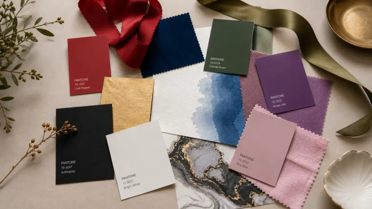
Common U.S. Color Pairings and Their Usual Meanings
The table below gives common modern readings. These are not universal laws. They are starting points for interpretation.
| Color combination | Common U.S. meaning | Where it often appears |
|---|---|---|
| Black and white | Contrast, formality, clarity, mourning, minimalism | Fashion, photography, weddings, logos, funerals |
| Red and gold | Celebration, wealth, warmth, luxury, attention | Holidays, packaging, decor, ceremonies |
| Blue and white | Trust, calm, cleanliness, order | Healthcare, coastal decor, corporate design, flags |
| Green and brown | Nature, earthiness, stability, sustainability | Organic brands, interiors, outdoor gear |
| Purple and gold | Royalty, achievement, ceremony, prestige | Schools, sports, awards, religious decor |
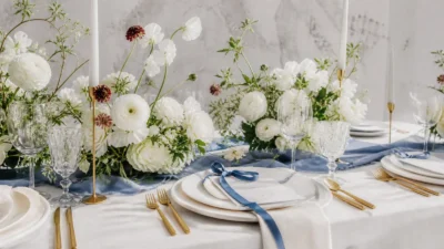
| Pink and white | Softness, care, romance, innocence | Weddings, gifts, beauty brands, baby decor |
A combination becomes stronger when it appears in a repeated cultural setting. That is why holiday palettes, flag colors, school colors, and sports colors feel so recognizable.
Red and Gold: Celebration, Wealth, Heat, and Attention
Red and gold is one of the most attention-grabbing combinations. In the United States, it often suggests celebration, luxury, warmth, and excitement.
The reason is partly visual. Red is intense. Gold suggests shine, metal, value, and ceremony. Together, they feel rich and active. They do not fade into the background.
This pairing appears in holiday packaging, theater interiors, formal invitations, awards, restaurant design, and festive decor. It can feel joyful, dramatic, or expensive.
Cross-cultural context matters. In some East Asian traditions and communities, red and gold can be tied to good fortune, celebration, weddings, and New Year festivities. In a U.S. setting, those associations may appear through cultural festivals, restaurant design, clothing, or family celebrations. It is important not to reduce that meaning to decoration. For many people, it is connected to living heritage.
Red and gold can also feel commercial. On packaging, it may be used to make a product look premium. In sports uniforms, it can signal strength and confidence. In tattoos, it may suggest ambition, passion, victory, or personal pride, but the design matters more than the colors alone.
Black and White: Contrast, Formality, Mourning, and Moral Clarity
Black and white is one of the most flexible color combinations.
In American culture, it often suggests contrast. That contrast can feel clean and modern, like a minimalist logo. It can feel formal, like a tuxedo or black-tie invitation. It can feel historical, like an old photograph. It can also feel solemn because black has long been associated with mourning in many Western settings.
The pair can also suggest moral clarity: right and wrong, yes and no, truth and falsehood. That reading is common in language, film, and visual storytelling. But it can oversimplify real life. Not every black-and-white symbol is about good and evil.
In fashion, black and white often signals control, polish, and restraint. In interiors, it can feel modern or severe. In weddings, white may carry meanings of ceremony, formality, or purity, while black may add elegance or seriousness.
In tattoos, black and white usually has a different meaning. It may simply refer to ink style, shading, tradition, or visual preference. A black-and-white rose, skull, angel, or animal needs to be read through the image, not only the palette.
Blue and White: Trust, Cleanliness, Calm, and Civic Order
Blue and white often feels calm, clean, and orderly to U.S. audiences.
That meaning comes from several overlapping uses. Blue is widely used by corporate, medical, government, and technology brands because it tends to feel steady and dependable. White can suggest cleanliness, open space, simplicity, or ceremony. Together, they often read as trustworthy and restrained.
Blue and white also appears in coastal decor. There, the pairing can suggest sea, sky, air, and summer light. In home design, it may feel fresh rather than corporate.
In religious or spiritual settings, blue and white may carry more specific meanings. In some traditions, blue can be linked with heaven, protection, devotion, or sacred presence. White may suggest purity, peace, mourning, or holiness, depending on the tradition. These meanings should be interpreted within the specific faith or community, not treated as one global code.
In tattoos and jewelry, blue and white may suggest peace, clarity, loyalty, water, memory, or personal healing. But those readings are usually personal unless the design belongs to a known religious, national, or cultural symbol.
Red, White, and Blue in the United States
For U.S. readers, red, white, and blue most strongly suggests the American flag.
The documented flag history is specific. The early flag design used thirteen stripes and stars to represent the original colonies and a new constellation. Later civic explanations connected the colors with values such as bravery, purity, and justice, especially through national emblem traditions.
Today, the palette means more than one thing. It can express patriotism, military service, national holidays, elections, civic identity, sports pride, or public ceremony. It appears heavily around Memorial Day, Independence Day, Veterans Day, campaigns, parades, and national news events.
The same palette can also be politically charged. In some settings, red, white, and blue feels inclusive and ceremonial. In others, it may signal a specific political message, protest, campaign, or argument about national identity.
That does not erase its older civic meaning. It does mean the setting matters. A flag on a public building, a campaign hat, a sports jersey, and a distressed flag tattoo do not communicate the same thing.
This is one place where symbolism needs care. National colors can bring pride, grief, disagreement, belonging, exclusion, memory, and protest into the same visual field.
Green and Brown: Nature, Stability, Sustainability, and Earthiness
Green and brown is usually read as natural, grounded, and earthy.
The connection is easy to understand. Green recalls plants, leaves, fields, renewal, and growth. Brown recalls soil, wood, leather, bark, and natural materials. Together, they suggest the outdoors.
In the United States, this combination appears in organic food packaging, hiking gear, gardening brands, coffee shops, cabins, rustic weddings, and eco-minded design. It can suggest simplicity, health, durability, and environmental care.
But there is a difference between symbol and proof. A green-and-brown label can make a product look natural without proving that it is sustainable. This is why color symbolism can be persuasive in marketing.
In decor, green and brown often feels calm and stable. Sage green with warm wood suggests softness and comfort. Forest green with dark brown feels heavier and more traditional. Olive and tan can suggest military or utility style.
In tattoos, green and brown often supports plant, animal, forest, mountain, or earth imagery. The symbolic meaning usually comes from the subject: a tree, snake, bear, vine, mountain, or mushroom.
Purple and Gold: Royalty, Ceremony, Achievement, and Sacred Echoes
Purple and gold often suggests status, ceremony, achievement, and prestige.
Part of this meaning comes from history. Purple dyes and rich golden materials were difficult or costly to produce in many older societies. Because of that, purple and gold became linked with power, rank, wealth, and ceremony in many places.
In the United States, the pair appears in school colors, sports teams, awards, Mardi Gras settings, formal branding, religious vestments, graduation materials, and luxury design. It can feel proud, dramatic, or ceremonial.
Religious meanings need special care. Purple may be used in certain Christian liturgical seasons, while gold can suggest glory, holiness, celebration, or sacred light in some church settings. These meanings are not the same across all religions or denominations.
In modern fashion and branding, purple and gold can simply mean “premium.” In tattoos, it may suggest confidence, self-worth, victory, royalty, spiritual devotion, or remembrance. The surrounding image decides the stronger meaning.
Pink and Red, or Pink and White: Romance, Softness, Youth, and Care
Pink and red often suggests romance, affection, sweetness, and emotional warmth in modern U.S. culture. The connection is especially strong around Valentine’s Day.
Red brings intensity. Pink softens it. Together, they can suggest love that is passionate but also playful or tender.
Pink and white has a different feel. It often suggests softness, care, innocence, youth, beauty, or gentle celebration. It appears in weddings, baby showers, floral design, skincare packaging, and gift wrap.
These meanings are modern and culturally shaped. Pink was not always assigned to girls in the same way Americans often assume today. Gendered color rules changed over time through fashion, retail, magazines, and family culture.
That history matters because pink can be used in many ways now. It can be delicate, ironic, glamorous, rebellious, nostalgic, romantic, or political. A hot pink and black punk design does not mean the same thing as pale pink and white wedding flowers.
How to Read a Color Combination Without Overreading It
Color symbolism is useful, but it is easy to overread.
A palette can suggest a mood. It rarely proves an intention by itself. Before deciding what a color combination means, look at the full setting.
Use these checks:
- Setting: Is it a wedding, protest, logo, tattoo, flag, altar, or outfit?
- Culture: Does the palette belong to a specific community or tradition?
- Image: Are there objects, animals, words, flowers, or religious signs included?
- Tone: Are the colors bright, muted, pastel, neon, dark, metallic, or faded?
- Audience: Who is meant to understand it?
- Timing: Is it tied to a holiday, movement, trend, or event?
- Personal meaning: Did the wearer, artist, or family choose it for private reasons?
This is especially important for tattoos. A black-and-red tattoo may look intense, but it could honor a sports team, a loved one, a favorite album, a cultural symbol, or a personal story. A blue-and-white tattoo may look peaceful, but the meaning can change completely if it includes waves, wings, eyes, flowers, or religious imagery.
The same caution applies to decor and fashion. A white outfit can suggest bridal ceremony, summer minimalism, mourning in some cultural settings, spiritual devotion, or simply personal taste.
Color is a language, but it is not a dictionary.
Color Combinations in Branding, Fashion, Decor, and Digital Culture
Modern Americans often learn color meanings through commercial life.
Brands use color combinations to create instant impressions. Blue and white can feel dependable. Red and yellow can feel fast and energetic. Black and gold can feel premium. Green and beige can feel natural. Purple and silver can feel imaginative or futuristic.
Fashion uses color in a more personal way. Black and white can look formal. Red and black can feel bold. Cream and tan can feel relaxed. Pink and red can look romantic or playful. Neon combinations can feel youthful, sporty, or digital.
Home decor adds another layer. A palette changes with texture and material. Green and brown in velvet and dark wood feels different from green and brown in linen and rattan. White and blue in ceramic tile feels different from white and blue in a medical office.
Digital culture moves faster. A color combination can become tied to a trend, fandom, album era, meme, app design, or online identity. These meanings can be real for a community, but they may not last for long.
That is why a careful article about color should not treat every online palette as ancient symbolism. Some meanings are old. Some are religious. Some are national. Some are commercial. Some are only a trend.
When Color Symbolism Becomes Misleading
Color symbolism becomes misleading when people flatten it into one answer.
The most common mistake is claiming that one color pair has the same meaning everywhere. It does not. White may suggest weddings in many U.S. contexts, but mourning in some other cultural and religious settings. Red may suggest danger, romance, luck, sacrifice, politics, or celebration depending on where it appears.
Another mistake is treating modern branding as ancient wisdom. A company may use blue because it tests well with customers, not because blue has one sacred meaning. A wellness brand may use green because it looks natural, not because the product is more ethical.
A third mistake is ignoring harm or political use. Some color combinations have been used by movements, governments, extremist groups, protest groups, or national projects. When a palette appears with specific symbols, slogans, or uniforms, the meaning can become much more charged.
This does not mean ordinary colors are dangerous. It means colors should be read with their full visual context.
Respect also matters. Religious and cultural palettes should not be reduced to “vibes.” If a color combination belongs to a living tradition, its meaning should be explained carefully and not borrowed as decoration without thought.
FAQs
What do color combinations symbolize?
Color combinations symbolize relationships between colors, such as contrast, harmony, warmth, calm, formality, celebration, or warning. Their meaning depends on setting, culture, history, and use.
Are color combination meanings universal?
No. Some reactions may be widely shared because of nature, visibility, or common signs, but symbolic meanings vary by culture and time. A responsible interpretation avoids claiming that one palette means the same thing everywhere.
What does black and white symbolize?
Black and white often symbolizes contrast, formality, simplicity, mourning, or clear opposition. In modern design, it can also suggest minimalism, elegance, or visual authority.
What does red and gold symbolize?
Red and gold often suggests celebration, wealth, ceremony, warmth, and attention. In some cultural settings, it may also connect with good fortune or festive tradition, so the setting should guide the interpretation.
What color combinations are meaningful for tattoos?
Meaningful tattoo palettes depend on the image and personal story. Black and red may feel intense, blue and white may feel calm, and green and brown may feel earthy, but the symbol itself matters more than the colors alone.
What colors symbolize trust and peace?
Blue and white often suggest trust, calm, cleanliness, or peace in U.S. design. Green and beige can also feel peaceful because they suggest nature and softness.
Can color combinations have negative meanings?
Yes. Red and black may feel aggressive in some settings, yellow and black may warn of danger, and national colors can become politically charged. Negative meaning usually comes from context, not the palette alone.
Conclusion
Color combinations work because they create relationships. One color adds pressure, softness, contrast, warmth, or seriousness to another.
The clearest meaning usually comes from the setting. A palette on a flag, a wedding invitation, a tattoo, a sports uniform, and a brand package should not be read the same way.