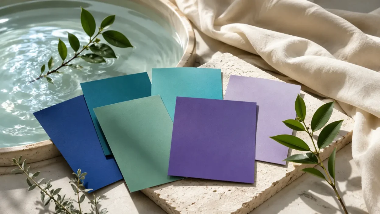
Cool colors are the blues, greens, teals, violets, and many blue-based purples that sit on the calmer side of the color wheel. In everyday life, people notice them in ocean photos, spa interiors, hospital logos, sports uniforms, wedding palettes, tattoos, clothing, and phone wallpapers.
The phrase cool color meanings usually points to more than art class. People want to know why these colors feel peaceful, serious, clean, sad, natural, expensive, or spiritual depending on the setting.
In the United States today, cool colors most often suggest calm, trust, nature, reflection, distance, and emotional control. But those meanings are not automatic. A navy suit, a mint nursery, a green dollar bill, and a lavender pride symbol all use the “cool” side of color in different ways.
Quick Answer
In modern U.S. symbolism, cool color meanings usually center on calm, trust, nature, reflection, healing, distance, and emotional restraint. These meanings developed from long-standing links with water, sky, shade, plants, night, and quiet spaces, but they change by shade, culture, and context.
TL;DR
- Cool colors often suggest calm and distance.
- Blue commonly means trust, peace, or sadness.
- Green suggests nature, growth, money, or safety.
- Purple can mean royalty, mystery, or identity.
- Shade and context change the meaning.
- Color psychology is suggestive, not absolute.
What Cool Colors Are
Cool colors are usually the hues around blue, green, teal, violet, and blue-purple on the color wheel. They are called “cool” because people often connect them with cool physical experiences: water, ice, shadow, clear skies, forests, and evening light.
This does not mean the color itself has a temperature. It means the color has a visual and emotional association. Red, orange, and yellow tend to feel warmer because they remind people of fire, sun, heat, and ripe fruit. Blue and green often feel cooler because they point toward shade, water, leaves, and open air.
The boundary is not always fixed. A yellow-green can feel warmer than a deep pine green. A red-violet can feel warmer than a blue-violet. Gray can feel cool when it has blue undertones, but warmer when it leans beige or brown.
So “cool colors” are best understood as a family, not a strict rulebook.
The Core Meaning of Cool Colors Today
In the United States today, cool colors most often symbolize calm, steadiness, trust, privacy, health, nature, intelligence, reflection, and emotional control.
That is why cool palettes show up so often in places that want to feel safe or composed. Banks use deep blues to suggest dependability. Wellness brands use soft greens and aquas to suggest freshness. Bedrooms and bathrooms often use blue, sage, seafoam, or lavender because those colors can make a room feel quieter.
Cool colors can also suggest distance. A pale blue room may feel open and airy. A navy suit may feel professional but reserved. A misty gray-blue photograph may feel lonely, thoughtful, or cold.
The same coolness that makes these colors soothing can also make them feel detached. That is one reason blue can mean both peace and sadness.
Why Cool Colors Became Linked With Calm and Distance
Many cool color meanings come from repeated visual experiences. People see blue in the sky and ocean. They see green in plants, grass, and forests. They see violet and deep blue in twilight, shadow, and night.
Those repeated links shaped symbolic habits. Blue became tied to openness, depth, heaven, distance, cleanliness, and trust. Green became tied to life, growth, fertility, money, safety, and nature. Purple and violet became tied to rare materials, mystery, ceremony, imagination, and spiritual settings.
There is also a visual reason. Cool colors often seem to recede in art and design, especially compared with bright reds, oranges, and yellows. A blue background can look farther away. A warm orange object can seem closer or more active.
Still, it is important not to overstate this. Color meanings are not magic commands. A color may suggest a mood, but it does not guarantee one. Lighting, culture, memory, contrast, material, and personal experience all affect how a color is read.
Blue: Trust, Peace, Sadness, and Authority
Blue is the anchor of the cool color family. It is the color most people think of first when they hear “cool colors.”
In U.S. culture, blue often means trust, calm, intelligence, loyalty, cleanliness, and seriousness. It appears in corporate logos, medical settings, government graphics, police uniforms, school colors, technology brands, and formal clothing.
Common blue meanings include:
- Light blue: openness, softness, air, gentleness, clarity.
- Navy: authority, professionalism, discipline, tradition.
- Aqua or turquoise: freshness, water, travel, wellness, escape.
- Gray-blue: quiet, restraint, melancholy, distance.
Blue also carries emotional tension. It can feel peaceful, but it can also mean sadness. Phrases like “feeling blue” show how strongly English connects blue with low mood. In music, “the blues” points to sorrow, endurance, memory, and expression.
In public life, blue can symbolize authority. That meaning is not neutral for everyone. Police-blue imagery may suggest safety and service to some Americans, while others connect it with conflict, protest, surveillance, or political tension.
So blue is not just peaceful. It can be protective, official, lonely, distant, loyal, or contested.
Green: Nature, Growth, Money, Safety, and Envy
Green sits between blue and yellow, which helps explain its wide range. It can feel cool and restful, but it can also feel lively, sour, artificial, wealthy, or strange depending on the shade.
In the United States, green’s strongest meanings are nature, growth, health, money, safety, luck, and environmental concern. Grass, leaves, gardens, forests, and spring make green feel alive. Dollar bills make green feel financial. Traffic signals and the phrase “green light” make it mean permission or safety.
Green also has older negative meanings. “Green with envy” connects it with jealousy. A green face can suggest sickness. A very neon green can feel toxic, digital, alien, or artificial rather than natural.
Modern green symbolism is especially strong in environmental language. “Going green” can mean reducing harm, supporting sustainability, or choosing nature-based products. But this meaning has also been overused. Some companies use green packaging or leaf imagery to imply responsibility without clear evidence. That is why green can now suggest both sincere care and marketing spin.
Green works best symbolically when the context supports the claim.
Purple and Violet: Royalty, Mystery, Creativity, and Identity
Purple is more complicated than blue or green. It is made from red and blue, so it can feel both warm and cool. Blue-based violet feels cooler, while reddish purple can feel warmer, richer, or more dramatic.
Historically, purple became linked with royalty, ceremony, wealth, and status because certain purple dyes were rare and costly. Over time, that association expanded into luxury, dignity, magic, spirituality, imagination, and artistic individuality.
In U.S. culture, purple can mean many things at once. A deep purple dress may feel elegant. A violet crystal shop logo may suggest spiritual interest. A lavender bedroom may feel soft and restful. A purple sports uniform may feel bold and energetic.
Purple also has identity meanings. Lavender and violet have appeared in LGBTQ+ history, sometimes as hostile labels and sometimes as reclaimed signs of community, resistance, style, and visibility. That history should be handled with care. Purple is not “the” single symbol of queer identity, but lavender and violet do carry meaningful associations in certain modern contexts.
Purple can also appear in mourning, military honor, religious seasons, and fantasy design. Its meaning depends heavily on shade and setting.
Shade Differences: Navy Is Not the Same as Aqua
Cool colors change meaning when they become lighter, darker, grayer, brighter, or more saturated. This is one reason simple color lists can be misleading.
| Cool shade | Common U.S. reading | Where it often appears |
|---|---|---|
| Navy blue | Trust, authority, discipline | Suits, logos, schools, uniforms |
| Sky blue | Peace, openness, clarity | Nurseries, wellness design, apps |
| Sage green | Calm, nature, restraint | Home decor, weddings, lifestyle brands |
| Emerald green | Wealth, growth, elegance | Jewelry, fashion, holiday decor |
| Lavender | Softness, reflection, identity | Bedrooms, weddings, beauty, pride contexts |
| Deep violet | Mystery, luxury, ceremony | Fashion, spirituality, fantasy design |
A cool color can also shift when paired with another color. Blue beside white may feel clean and medical. Blue beside orange may feel energetic because the contrast is strong. Green beside brown may feel earthy. Green beside black may feel sharp, digital, or intense.
The material matters too. Navy wool feels formal. Blue glass feels clean. Aqua plastic feels playful. Sage linen feels natural. The color is only part of the message.
Cool Colors in U.S. Homes, Clothing, and Everyday Design
Cool colors are common in American homes because they can make a space feel calmer, cleaner, or more open. Bedrooms often use blue, lavender, gray-green, or soft teal. Bathrooms use aqua, seafoam, white, and blue because they suggest water and freshness.
In clothing, cool colors can signal restraint or polish. Navy is a common business color because it feels serious without the heaviness of black. Mint, powder blue, and lavender can feel gentle or seasonal. Deep green can feel classic, outdoorsy, or expensive.
Cool colors also appear in weddings. Dusty blue, sage, eucalyptus green, lavender, and slate have become popular because they photograph softly and pair well with flowers, metal accents, and neutral fabrics.
In digital life, cool colors often suggest clean interfaces and calm moods. Meditation apps, finance apps, weather graphics, and health brands often use blue-green palettes because they feel orderly and low-pressure.
That does not mean cool colors are always quiet. Electric teal, neon green, royal blue, and ultraviolet can feel futuristic, sporty, rebellious, or high-energy.
Cool Colors in Branding, Sports, Politics, and Public Symbols
Cool colors are widely used in branding because they can suggest trust, cleanliness, security, nature, and expertise. Blue is especially common for banks, technology companies, healthcare brands, insurance companies, and universities. Green is common for grocery, wellness, energy, and environmental themes. Purple often appears in beauty, creativity, luxury, streaming, fantasy, and youth-oriented brands.
Sports teams use cool colors for identity more than psychology. A blue team does not automatically seem calm. It can seem fierce, traditional, regional, patriotic, or historic depending on the team story.
Politics adds another layer. In the United States, blue is now strongly associated with the Democratic Party, while red is associated with the Republican Party. That color code is relatively modern, but it has become deeply familiar through election maps, news graphics, signs, and merchandise.
Public symbols can make cool colors feel official. Blue can suggest law, order, and public service. Green can suggest safety, permission, parks, recycling, or environmental policy. Purple can suggest honor, remembrance, or ceremonial dignity.
These meanings are learned through repeated exposure. They are not built into the color itself.
Spiritual, Religious, and Folklore Readings of Cool Colors
Cool colors often appear in spiritual and religious interpretation, but these meanings should be described carefully. They are not universal, and they do not mean the same thing across traditions.
Blue may be linked with heaven, protection, truth, devotion, or spiritual communication in some settings. Green may suggest renewal, life, paradise, growth, or healing. Purple may appear with penitence, royalty, mystery, sacred authority, or spiritual imagination.
Folklore and modern spirituality often add more meanings. Some people read blue as emotional peace, green as heart-centered healing, and violet as intuition or higher awareness. These interpretations can be meaningful to believers, but they should not be treated as historical facts for all cultures.
The respectful approach is simple: ask what tradition, community, or personal practice is being referenced. A lavender candle in a meditation space, a purple church cloth, a green holiday decoration, and a blue protective charm do not all come from the same symbolic system.
Misuse, Oversimplification, and Context Problems
The biggest problem with cool color meanings is oversimplification. It is tempting to say blue means calm, green means nature, and purple means royalty. Those statements are useful starting points, but they are not enough.
Blue can also mean sadness, coldness, police authority, corporate distance, or political identity. Green can mean nature, but it can also mean money, envy, illness, luck, or misleading environmental marketing. Purple can mean luxury, but it can also mean mourning, spirituality, creativity, queer history, military honor, or fantasy.
Cool colors can also be used to soften a message that needs more proof. A green label does not make a product sustainable. A blue logo does not make a company trustworthy. A lavender aesthetic does not automatically show respect for LGBTQ+ history.
Context decides whether a meaning feels sincere, decorative, commercial, spiritual, political, or shallow.
FAQs
What do cool colors symbolize?
Cool colors usually symbolize calm, trust, reflection, nature, distance, and emotional restraint. In the United States, blue, green, teal, violet, and lavender often appear in settings meant to feel peaceful, clean, professional, natural, or thoughtful.
Are cool colors always calming?
No. Cool colors often suggest calm, but they are not always calming. A soft blue bedroom may feel restful, while an electric teal sports uniform or neon green sign can feel bold and intense.
What do cool color tattoos mean?
Cool color tattoos often suggest peace, healing, water, nature, spirituality, memory, or emotional depth. The design matters more than the color alone: a blue wave, green vine, violet flower, or teal butterfly will each carry a different meaning.
What is the spiritual meaning of cool colors?
In many modern spiritual interpretations, blue may suggest peace or truth, green may suggest healing or renewal, and violet may suggest intuition or mystery. These meanings depend on the tradition or personal belief system, so they should not be treated as universal.
Why do brands use cool colors?
Brands use cool colors because they can suggest trust, cleanliness, health, nature, security, or creativity. Blue is common in finance and technology, green in wellness and sustainability, and purple in beauty, entertainment, and luxury.
What is the difference between blue and green symbolism?
Blue often points to calm, trust, depth, authority, or sadness. Green more often points to nature, growth, safety, money, luck, health, or envy.
Are cool color meanings the same in every culture?
No. Some meanings are widely shared, but color symbolism changes by language, religion, history, politics, and local customs. A color that feels peaceful in one setting may suggest mourning, authority, protest, or sacred meaning in another.
Conclusion
Cool colors carry many of the meanings people expect from water, sky, shade, plants, twilight, and quiet spaces. They often suggest calm, trust, nature, reflection, and distance, but they can also point to sadness, authority, money, mystery, identity, or commercial messaging.