The emotional meaning of colors is the way people connect color with feelings, moods, values, and social messages. Red may feel urgent or romantic. Blue may feel calm or sad. Black may feel formal, protective, elegant, or heavy.
People care about color symbolism because color is everywhere. It appears in clothes, rooms, logos, flags, sports teams, weddings, funerals, warning signs, holiday decorations, and social media posts.
In the United States, color often works as a quick emotional signal. A red sale sign asks for attention. A white wedding dress suggests a certain tradition. A pink ribbon points to public awareness. A black suit can suggest respect, authority, grief, or style.
Still, color meanings are not fixed laws. They come from a mix of body response, nature, language, religion, history, marketing, personal memory, and culture. The same color can change meaning when the shade, place, person, or purpose changes.
Quick Answer
In modern U.S. culture, the emotional meaning of colors usually points to broad feelings: red suggests energy or danger, blue suggests calm or trust, green suggests nature or renewal, yellow suggests cheer or warning, black suggests power or mourning, and white suggests simplicity or purity. These meanings come from visible life cues, historic materials, religious use, language, fashion, and repeated public symbols.
TL;DR
- Color meanings depend on context.
- Red can mean love or danger.
- Blue often suggests calm, trust, or sadness.
- Green links nature, money, growth, and envy.
- Black and white carry strong cultural meanings.
- No color has one universal meaning.
What Color Symbolism Means in Everyday Life
Color symbolism is the use of color to stand for an idea, feeling, identity, or value. It is not the same as simple color preference. Liking blue does not prove a person is calm. Wearing black does not prove someone is sad.
Color works more like a shared emotional language. It gives people a fast impression before words arrive.
A hospital may use soft greens or blues to create a calmer mood. A sports team may use red to look bold and aggressive. A luxury brand may use black, white, or metallic tones to suggest control, polish, and restraint.
These meanings are learned through repetition. We see red on stop signs, emergency lights, Valentine hearts, and clearance stickers. Over time, one color gathers several emotional roles.
That is why color symbolism is useful but slippery. It can guide interpretation, but it should not be treated like a codebook.
The Core Emotional Meanings of Common Colors
The table below gives common modern U.S. associations. These are not rules. They are patterns that often appear in design, clothing, decor, language, holidays, and public symbols.
| Color | Common emotional meanings | Where it often appears |
|---|---|---|
| Red | Love, danger, urgency, anger, courage | Valentine’s Day, stop signs, sales, sports |
| Blue | Calm, trust, sadness, stability, distance | Banks, hospitals, uniforms, “the blues” |
| Green | Nature, growth, money, luck, envy | Eco branding, finance, St. Patrick’s Day |
| Yellow | Joy, hope, caution, attention, anxiety | School buses, ribbons, warning signs |
| Black | Elegance, grief, power, mystery, rebellion | Formalwear, funerals, luxury branding |
| White | Cleanliness, simplicity, innocence, space | Weddings, healthcare, minimal design |
A color can carry positive and negative meanings at the same time. Red can be a rose or a warning light. Green can mean spring growth or jealousy. Black can mean mourning or elegance.
The setting tells you which meaning is most likely.
Why Colors Feel Emotional in the First Place
Colors feel emotional partly because they are tied to things people already care about.
Red is linked with blood, heat, ripe fruit, fire, flushed skin, love imagery, warning signs, and political movements. Those links are not all the same, but they share intensity.
Blue is linked with sky, water, distance, uniforms, corporate trust, sadness in American speech, and calm design. It can feel open and steady, but also cold or lonely.
Green is linked with plants, spring, food freshness, money, traffic permission, illness, and envy. That makes it one of the most flexible colors in U.S. symbolism.
Some reactions may come from visibility and contrast. Bright red and yellow demand attention. Soft blue and green may feel less visually aggressive. But much of color meaning comes from learning. People absorb color codes from family, school, religion, media, brands, holidays, and public spaces.
Personal memory matters too. A color linked to a childhood kitchen, a school uniform, a favorite team, or a hospital room may feel different from its public meaning.
Warm Colors: Red, Orange, Yellow, and Pink
Warm colors usually feel active because they are close to fire, sunlight, heat, skin flush, and ripe food in everyday life. In modern U.S. design, they often suggest movement, appetite, joy, urgency, or affection.
Red is the strongest warm color in public symbolism. It often means love, passion, anger, danger, attention, courage, or power. The reason is not mysterious. Red is visually intense, easy to notice, and tied to body and survival cues such as blood, heat, and warning.
In the United States, red appears in stop signs, emergency lights, Valentine’s Day, sports uniforms, political graphics, sale signs, and red-carpet prestige. These uses pull red in several directions. It can say “come closer,” “pay attention,” or “stop now.”
Orange often means warmth, friendliness, energy, creativity, or caution. It is less romantic than red and less cheerful than yellow. In U.S. life, orange appears in traffic cones, safety vests, autumn decor, Halloween pumpkins, sports teams, and casual branding.
Because orange is highly visible, it can feel playful in one setting and practical in another. A burnt orange sweater may feel earthy and seasonal. A neon orange sign may feel urgent.
Yellow is emotionally split. It often suggests sunshine, happiness, hope, youth, clarity, and warmth. But it also appears in warning signs, caution tape, hazard labels, and school buses because it catches the eye.
That makes yellow both cheerful and alerting. A pale yellow kitchen may feel soft and friendly. A harsh yellow warning label is meant to interrupt you.
Pink is often linked with tenderness, romance, sweetness, care, femininity, and softness in modern U.S. culture. Those meanings are not ancient universals. They have been shaped by fashion, children’s products, advertising, gender norms, breast cancer awareness, and changing ideas of identity.
Pink can also be bold. Hot pink may feel rebellious, playful, campy, glamorous, or confident. Soft blush pink usually reads as gentle or romantic.
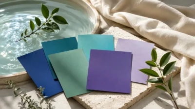
Cool Colors: Blue, Green, Purple, and Teal
Cool colors often feel calmer because they are linked with water, shade, distance, vegetation, evening, and depth. But they are not always soothing. A color can be cool and still carry authority, sadness, wealth, or mystery.
Blue is one of the most trusted colors in U.S. public life. It is common in banks, insurance companies, healthcare, police uniforms, technology brands, and government design. It often suggests trust, order, calm, duty, and competence.
Blue also carries sadness. Phrases such as “feeling blue” and “the blues” make blue part of American emotional language. This does not erase its calm meaning. It shows how one color can hold more than one emotional story.
Light blue may feel airy, clean, innocent, or peaceful. Navy blue often feels formal, professional, traditional, or serious.
Green is strongly tied to nature, growth, healing, renewal, and environmental concern. In the United States, it also means money, financial success, luck, permission, and sometimes envy.
Green’s emotional range comes from its daily associations. It is the color of plants, lawns, fresh produce, dollar bills, traffic lights, and many eco-friendly labels. Yet the phrase “green with envy” gives it a sharper emotional edge.
Soft sage green may feel calm and domestic. Bright lime green may feel energetic, artificial, youthful, or acidic. Dark green can suggest wealth, tradition, forests, or restraint.
Purple often suggests imagination, mystery, spirituality, luxury, grief, royalty, or creativity. Its historic prestige came partly from rare and costly dyes in some societies. In modern U.S. life, purple appears in spiritual branding, fantasy design, beauty products, sports teams, and awareness ribbons.
Purple is easy to overstate. It is not automatically “royal” in every context. A lavender bedroom feels very different from a deep purple velvet robe.
Teal and blue-green shades often suggest balance, emotional clarity, water, healing, and modern calm. In U.S. design, teal is common in wellness, healthcare, beach decor, and digital branding. It can feel clean without the coldness of pure blue.
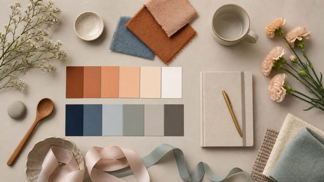
Neutral Colors: Black, White, Gray, Brown, and Beige
Neutral colors may look quiet, but symbolically they do a lot of work.
Black often carries emotional weight. In the United States, it is linked with mourning, formality, sophistication, power, rebellion, mystery, danger, and authority. A black funeral outfit and a black evening dress use the same color in different emotional frames.
Black is also sensitive because language and imagery have sometimes linked darkness with evil, threat, or inferiority. Those associations can overlap with racial bias and colorism. Responsible interpretation should avoid treating “dark” as morally bad or “light” as morally good.
White often suggests cleanliness, simplicity, openness, innocence, peace, and new beginnings in U.S. culture. It appears in weddings, hospitals, minimal interiors, religious clothing, and fresh design.
But white does not mean the same thing everywhere. In some cultures and religious settings, white can be linked with mourning, death, humility, or spiritual transition. In the U.S., its wedding meaning is strong, but not universal.
Gray often suggests neutrality, maturity, restraint, uncertainty, boredom, sadness, fog, professionalism, or compromise. It can feel sleek in design and gloomy in weather. Silver, a brighter relative of gray, often adds ideas of technology, elegance, age, or celebration.
Brown is tied to earth, wood, leather, coffee, bread, soil, autumn, and plain materials. It often suggests warmth, honesty, comfort, age, stability, practicality, or rustic life. It can also feel dull, heavy, poor, or old-fashioned depending on shade and setting.
Beige and tan often suggest calm, simplicity, natural materials, softness, and restraint. In decor and fashion, they can feel warm and flexible. Used without contrast, they can also feel bland.
How Shade, Saturation, and Context Change Meaning
Color meaning changes when the color changes.
A pale color often feels softer than a saturated one. Blush pink feels gentle. Hot pink feels loud. Pale blue feels airy. Navy feels serious. Mint green feels fresh. Forest green feels grounded.
Brightness also matters. Neon colors feel modern, playful, artificial, or urgent. Muted colors feel older, calmer, more natural, or more refined. Pastels can feel sweet, nostalgic, youthful, or gentle. Jewel tones can feel rich, dramatic, formal, or festive.
Context matters even more.
Red roses on Valentine’s Day suggest romance. Red lights behind a police car suggest danger or authority. Red numbers in a bank account suggest loss. Red jerseys in a stadium suggest team identity.
The object changes the color. So does the room, event, culture, season, and person using it.
This is why a good interpretation asks, “Where is the color appearing, and what is it doing there?”
Historical Roots: Pigments, Status, Religion, and Trade
Color symbolism often begins with material history. Before synthetic dyes and mass printing, some colors were hard to make, costly to keep bright, or tied to special materials. That affected who could wear them and where they appeared.
Purple is the classic example. In some ancient Mediterranean settings, certain purple dyes were rare and expensive, so purple became linked with status, rule, and ceremony. That history still echoes in modern phrases about royalty, even when purple fabric is now easy to buy.
Red has a long history because red pigments and dyes were vivid and memorable. Across different times and places, red could be linked with blood, vitality, death, victory, protection, fertility, wealth, or danger. The meaning depended on the culture and object.
White and black gained strong roles in religious and social life because they marked contrast. White cloth could suggest purity, initiation, sacred service, cleanliness, or mourning depending on tradition. Black clothing could suggest humility, authority, grief, formality, or separation.
Religious meanings should be handled with care. A color may have a living meaning inside a faith tradition that is not the same as its use in home decor, tattoos, or online mood charts. For example, a liturgical color, a festival color, and a fashion color may share a hue but not the same purpose.
How Americans Use Color Symbolism Now
In the United States, color symbolism is especially visible because public life is full of color codes.
Branding uses color to create first impressions. Blue often appears where trust and steadiness matter. Red appears where speed, appetite, attention, or excitement matter. Green appears in natural, financial, wellness, and environmental contexts. Black, white, and metallic tones often suggest elegance or control.
Clothing uses color as social mood. Black can look formal, private, chic, or grieving. Red can look bold or romantic. White can look clean, bridal, summery, or ceremonial. Earth tones can suggest ease, practicality, or natural taste.
Home decor uses color to shape atmosphere. Soft blues and greens are common in bedrooms, bathrooms, and wellness spaces. Warm neutrals can feel cozy. Bright yellow or orange can energize a room but may feel overwhelming in large amounts.
Holidays rely heavily on color:
- Red and green signal Christmas for many Americans.
- Orange and black signal Halloween.
- Red, white, and blue signal national identity.
- Pastels often signal Easter and spring.
- Red and pink signal Valentine’s Day.
Weddings also use color symbolism. White remains common in U.S. bridal tradition, but many couples now choose colors based on personal taste, season, family culture, religion, or theme.
Sports use color for loyalty and identity. A team color can become emotional because fans connect it with place, family, wins, losses, and belonging.
Politics uses color as shorthand, though meanings shift by country. In the United States, red and blue have become strongly tied to the two major political parties. That is a modern political code, not a timeless meaning of either color.
Awareness campaigns use ribbons, lights, and clothing to make support visible. Pink is widely tied to breast cancer awareness. Red can be tied to HIV/AIDS awareness, heart health, or substance-abuse prevention depending on context. Yellow ribbons have been used for hope, remembrance, and waiting for someone’s safe return. These meanings are modern public symbols, not ancient color laws.
Where Color Meanings Get Misused or Oversimplified
Color symbolism is easy to flatten into a chart. That is where mistakes happen.
The first mistake is treating color as universal. Some color-emotion patterns appear widely, but culture changes meaning. White may suggest weddings in one setting and mourning in another. Red may mean danger in one place and good fortune in another.
The second mistake is treating color as mind control. A red button may attract attention, but it does not force action. A blue wall may feel calm to many people, but not to everyone. Lighting, memory, culture, shade, contrast, and situation all matter.
The third mistake is confusing spiritual tradition with online interpretation. Color has real religious and ceremonial meanings in many traditions, but those meanings are specific. They should not be reduced to “purple means spiritual” or “white means pure” without context.
The fourth mistake is ignoring harmful language. In English, phrases can link blackness with badness and whiteness with goodness. These patterns are common, but they are not harmless. A careful reader can notice them without repeating them as moral truths.
The fifth mistake is overreading personal choices. A person wearing gray may not be depressed. A person painting a room green may not be seeking healing. Color can express feeling, but it can also be practical, fashionable, affordable, inherited, or simply preferred.
How to Interpret Color Meaning Responsibly
A responsible color reading starts with context.
Ask these questions before deciding what a color means:
- What object or setting is using the color?
- Is the meaning emotional, religious, political, commercial, or personal?
- Is the color bright, muted, pale, dark, warm, or cool?
- Is the color part of a holiday, ceremony, uniform, logo, flag, or campaign?
- Is the meaning U.S.-specific or borrowed from another culture?
- Is the claim based on history, belief, fashion, or modern design habit?
This approach keeps color symbolism useful without making it rigid.
For everyday use, think of color as a clue. Red may suggest intensity. Blue may suggest steadiness. Green may suggest growth. Black may suggest formality. White may suggest clarity. But the final meaning comes from the full scene.
A color rarely speaks alone.
FAQs
What color represents emotion the most?
Red is often the strongest emotional color in modern U.S. symbolism because it is linked with love, danger, anger, courage, and urgency. It is visually intense and appears in many high-attention settings, from stop signs to Valentine’s Day.
What color means sadness?
Blue is the color most commonly linked with sadness in American English because of phrases like “feeling blue” and the musical tradition of “the blues.” The same color can also mean calm, trust, loyalty, or distance, so the setting matters.
What color means love?
Red is the most common U.S. color for romantic love, especially through roses, hearts, lipstick, Valentine’s Day, and formal romantic imagery. Pink often suggests softer affection, tenderness, sweetness, or care.
Are color meanings spiritual?
Some color meanings are spiritual within specific religious or cultural traditions. But broad online claims about color spirituality are often modern interpretations, so it is better to name the tradition and context instead of treating one meaning as universal.
What do colors mean in tattoos?
In tattoos, color can add mood, identity, contrast, or personal memory. Red may intensify passion or danger, black may add seriousness or permanence, green may suggest growth or nature, and blue may suggest calm or grief, but the design matters more than the color alone.
Do colors really affect mood?
Colors can shape atmosphere and trigger associations, but they do not affect everyone the same way. A room color, outfit, or logo may influence first impressions, yet personal history, lighting, culture, and context all shape the response.
Why do color meanings change over time?
Color meanings change because materials, fashion, religion, politics, technology, and public symbols change. A color that once showed wealth because it was rare may later become common, while a color used in a campaign, flag, or brand can gain a new public meaning.
Conclusion
Color symbolism is useful because it helps people read emotion quickly. Red can warn or attract. Blue can soothe or sadden. Green can renew or signal money. Black and white can carry strong messages of formality, grief, simplicity, purity, or power